
Healix: Mindful Audio 🧬 Apple Watch & Mobile App
Brief: The world has been battling the Coronavirus Disease 2019 (COVID-19), which does not currently have any vaccines or specific treatments. While medical researchers and practitioners battle the virus, we as designers can still play a part. Due to social distancing restrictions, many of us are staying at home and sitting down more than we usually do. It is hard for many of us to get enough beneficial exercise every day (World Health Organisation, 2020). Design an interface that promotes physical activity at home.
Project Duration: 12 weeks
Team Members: Christina Liu & Louise Zhang
Tools: Adobe Illustrator, Adobe Photoshop, Figma & Miro
Awards: Received top marks in the cohort
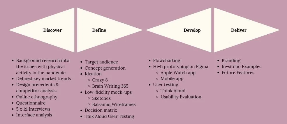
Problem Definition
Home fitness has been in our lives for decades. Problematic at its early beginnings for targeting women at home, staying fit "for" their husbands at work (Lufkin, 2020), it still remains a stable routine of exercise for some. However, home fitness has taken on a new role since the advent of COVID-19. The pandemic forced gyms to close, social distancing changed routines, and many increased their sedentary behaviour during lockdown, posing not only a greater burden on our economy (Gentil et al., 2020), but also for our health.
Whether it is a yoga class on Zoom, or panic-buying a Pelaton, many are trying to find ways to exercise effectively within the confines of their four walls. In following these objectives, our design will endeavour to create a final solution: to design an interface that helps promote users to do physical activity at home as part of their daily schedule.
Our aims for this research stage of the project is to:
- Understand the design context and problem space: who the users of our future product may be, the interfaces we are designing for and the similar existing solutions in the market.
- Conduct user research to help ground our future design solution in real user requirements, looking at demographic, lifestyle, needs and wants, preferences and existing solutions already in use.
- Identify improvements to be gained by developing a new solution.
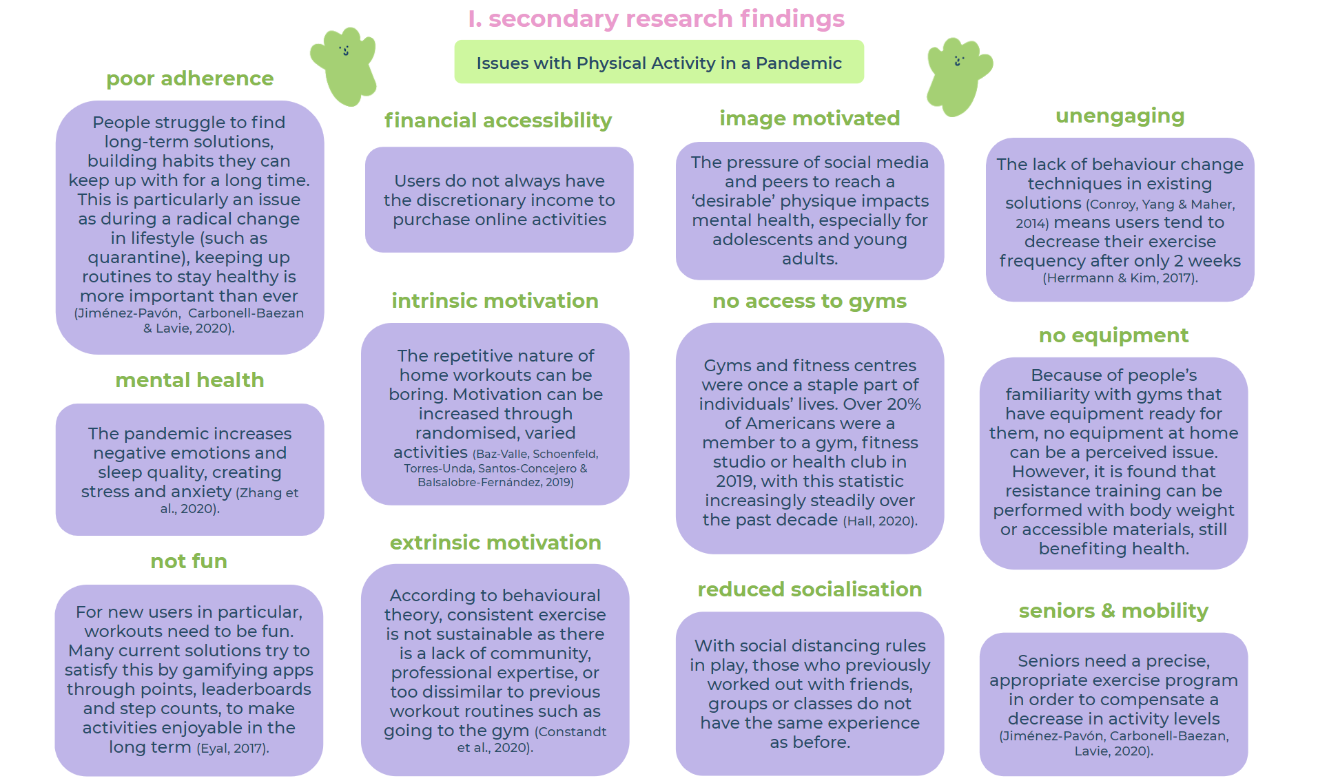
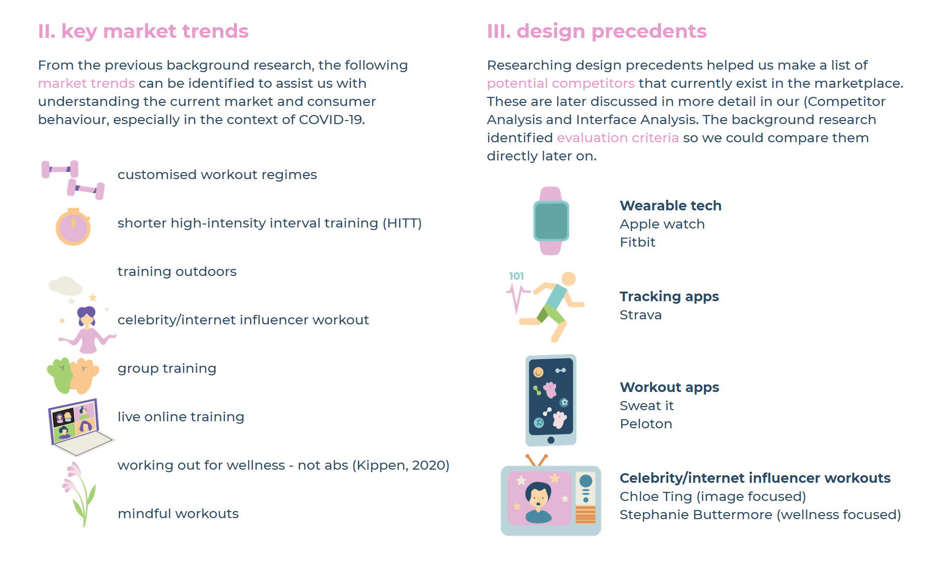
Background Research
To gain greater understanding of the problem space, context and issues, we conducted extensive secondary research across multiple platforms: academic literature, fitness blogs, news outlets and direct competitor website. These were then used to form a mind-map on Miro, loosely based on the 5 Whys technique to define an underlying root cause (Tomitsch et al., 2018).
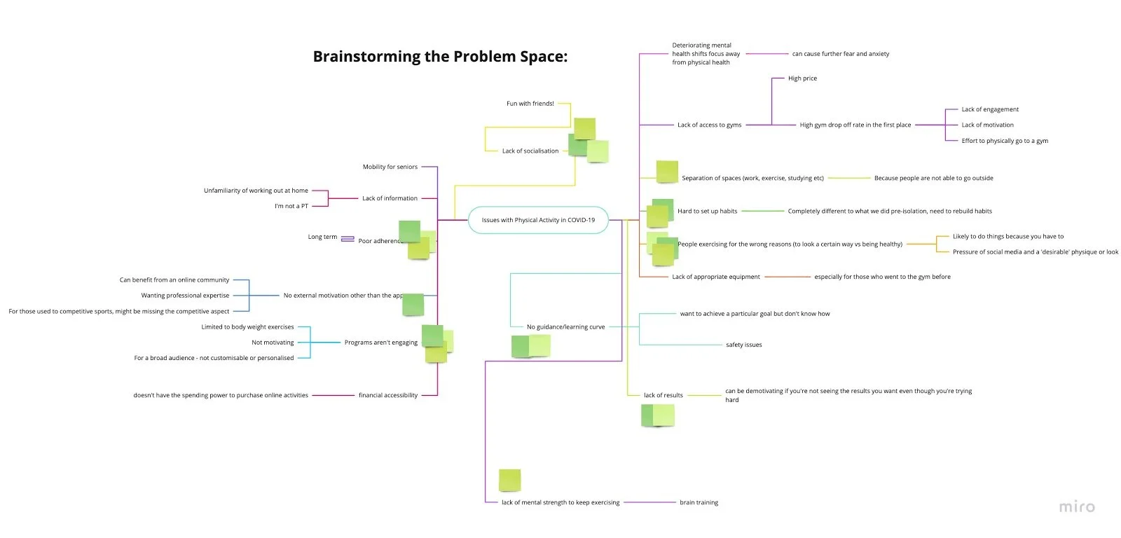
The main research points are illustrated here:
Online Ethnography
Online ethnography was then undertaken to understand existing perceptions of competitors in the fitness industry, and discover what problems users were facing.
Method
We utilised passive observation on social networks, forums and comments to gather research data. As highly active users of the platforms already, it was only necessary for us to use the one observation method to understand the online communities.
An affinity diagram assisted us in converging multiple viewpoints and ideas into several key findings.
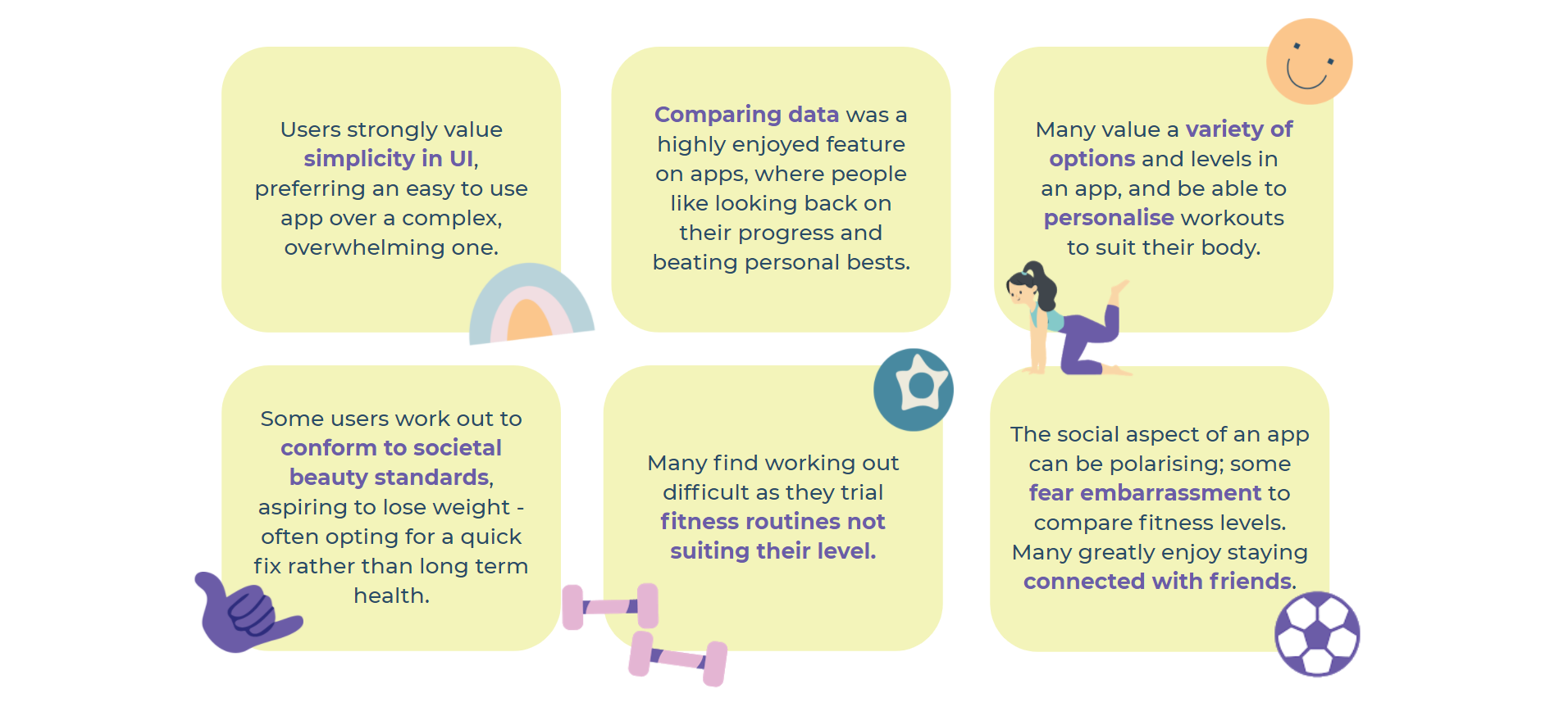

Results
We discovered things users know (that we did not), problems they experienced and areas of opportunity that need to be considered. The data also bolstered our understanding of the fitness landscape and specific traits of users we may want to target.
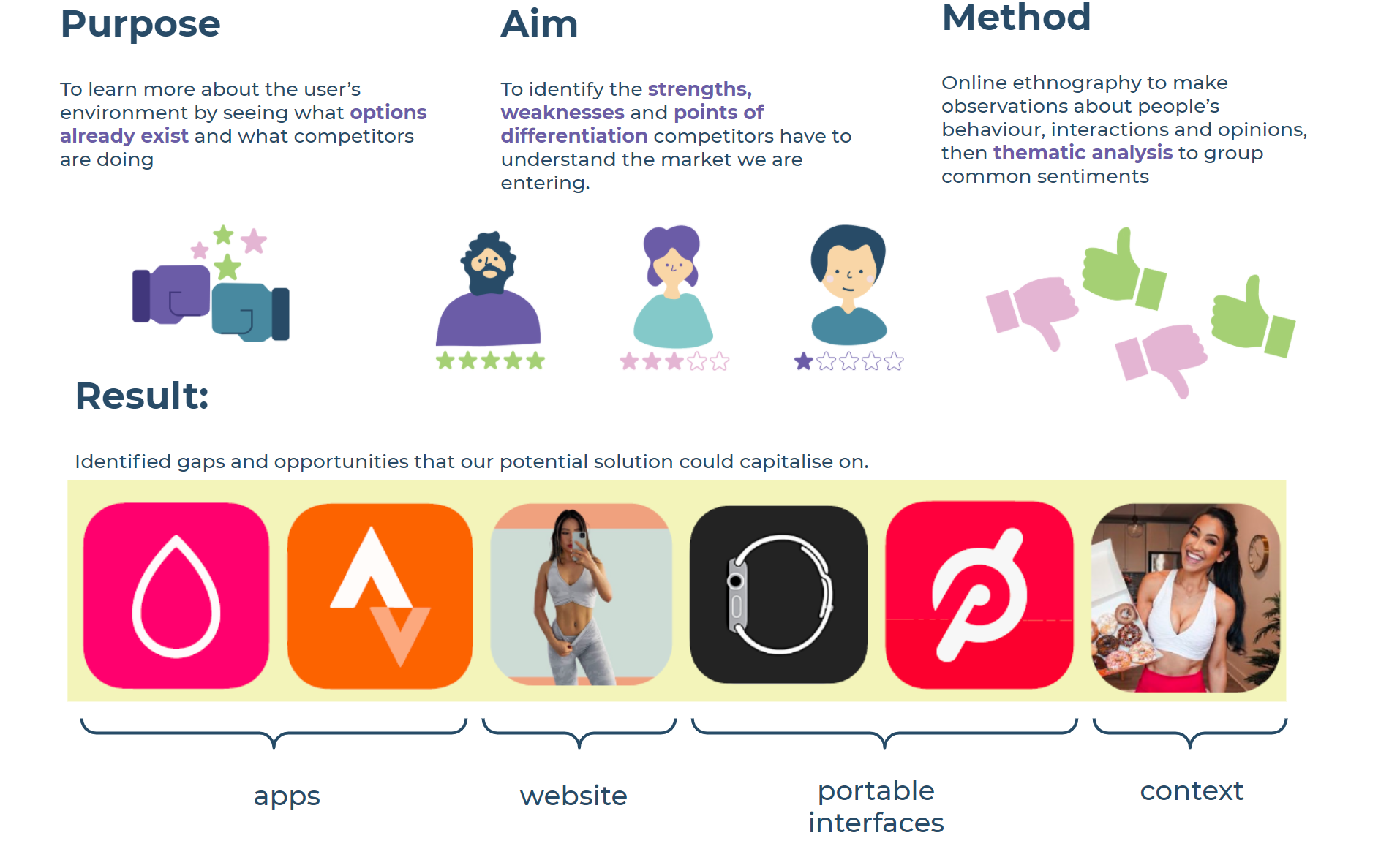
Competitor Analysis
Then, a look into various types of competitors allowed us to examine the current market.

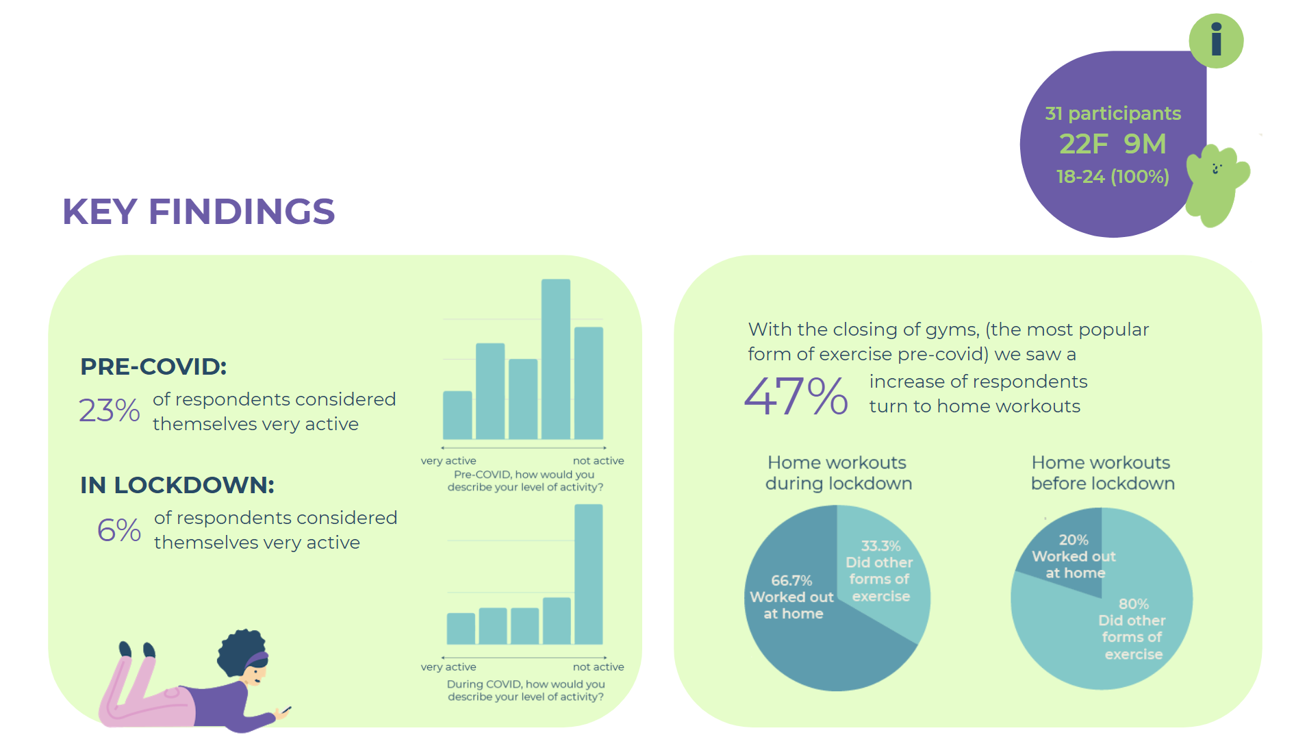
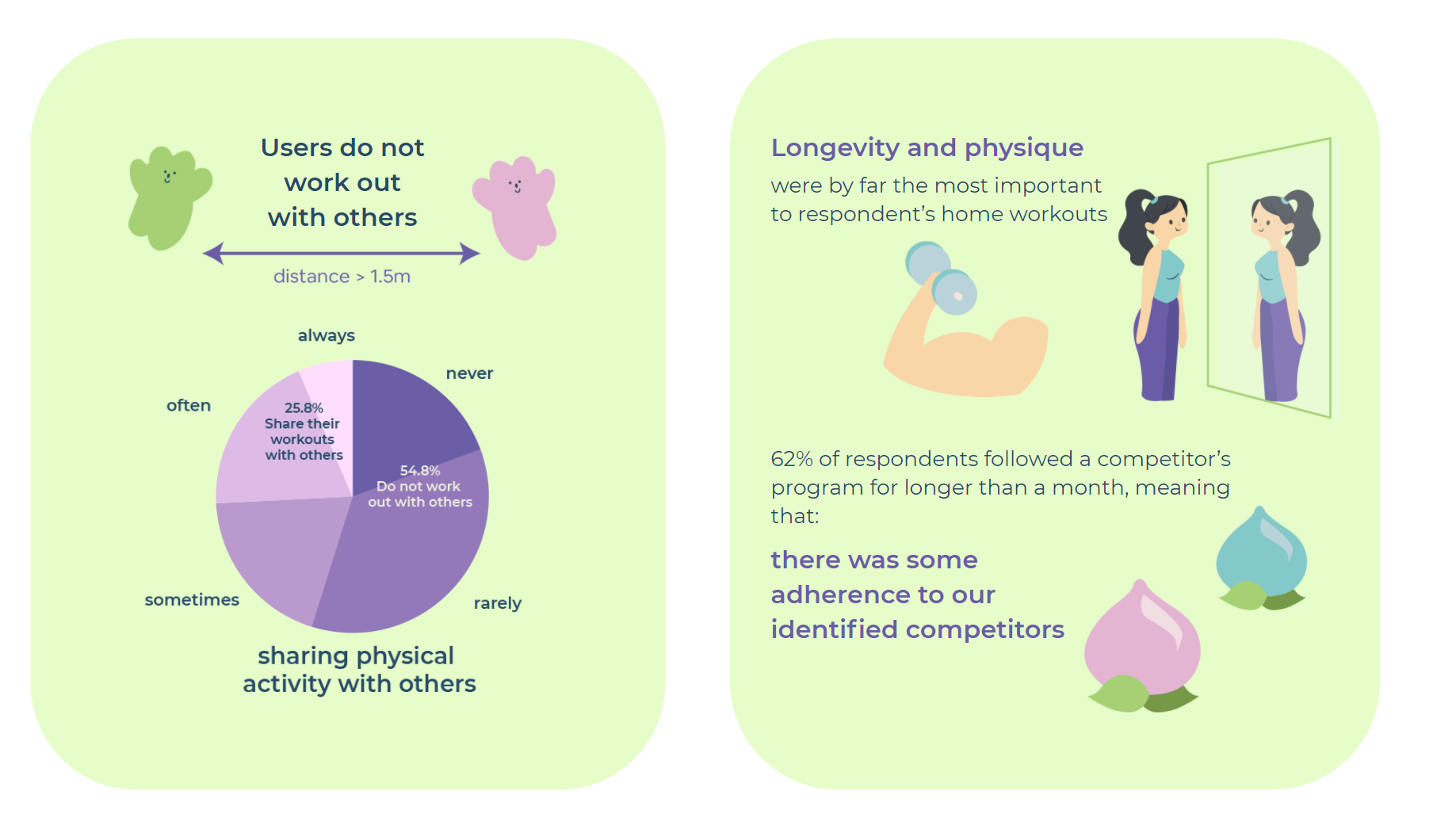
Questionnaire
A questionnaire composed of 13 questions allowed us to gather quantitative data, surveying a larger sample size to compare average activity levels before and after lockdown began. We also began to understand user’s current habits, what solutions they already tried, and commitment levels to working out in quarantine.
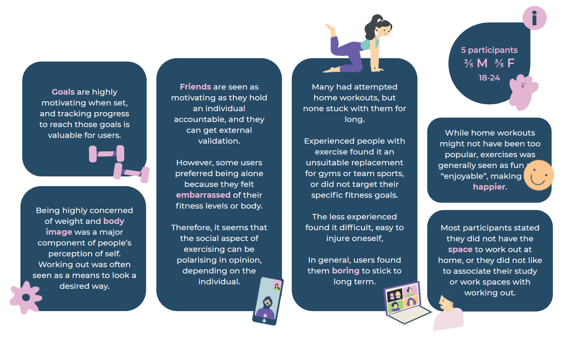
1:1 Interviews
Using an affinity diagram to collate qualitative data from 5 participants, we discovered further insights into individual user needs. A semi-structured interview format was chosen to allow “an open response in the participant’s own words” (Clifford, 2016).

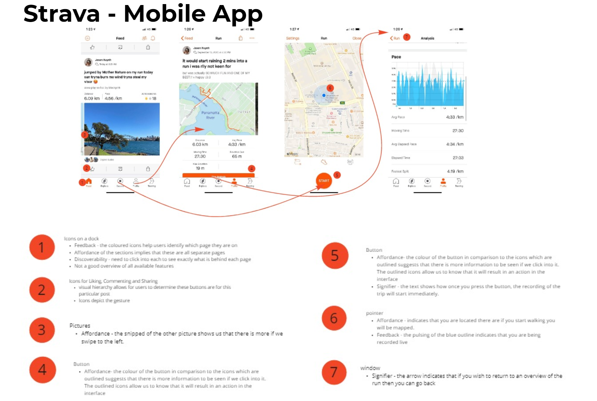
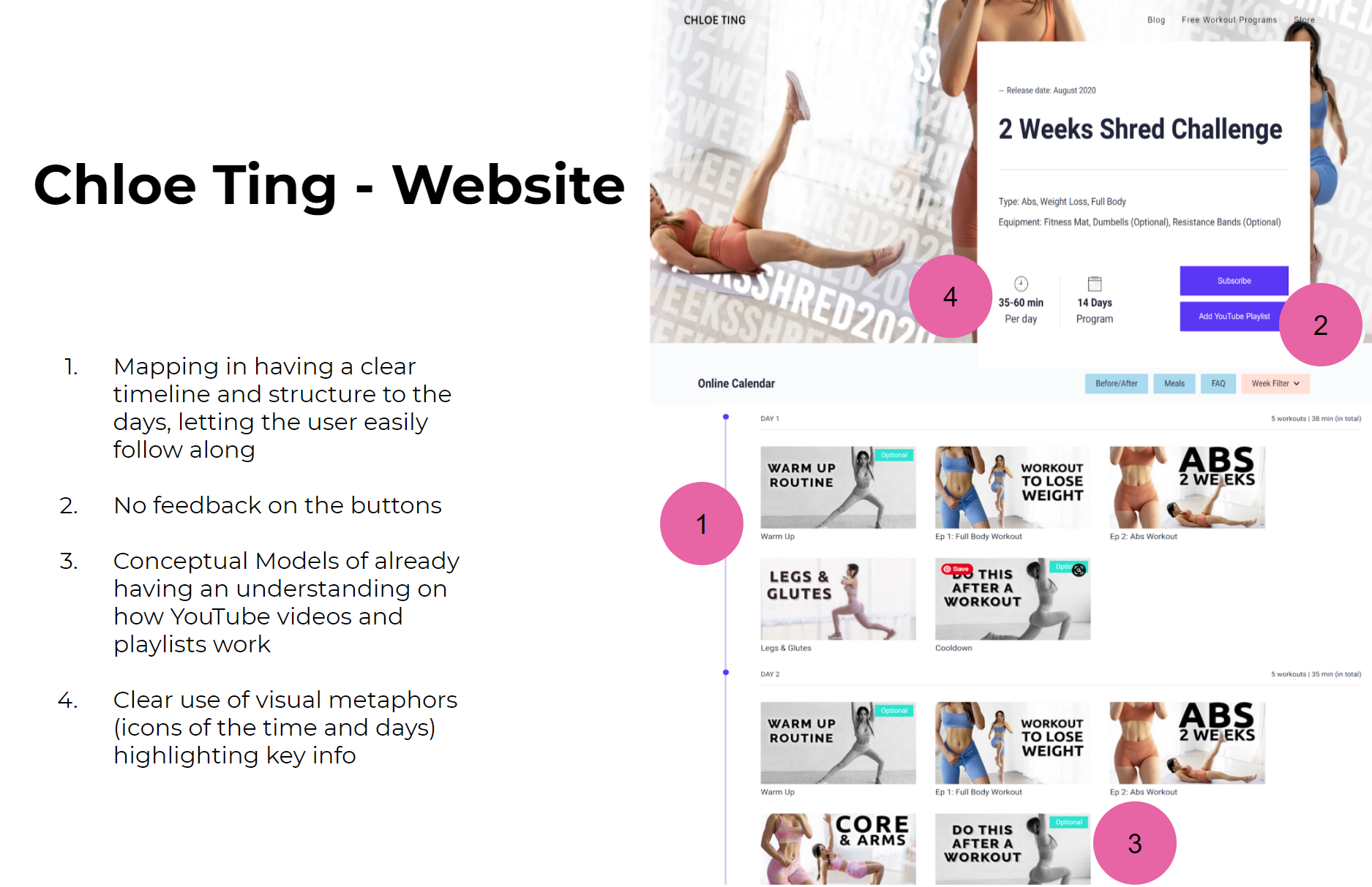
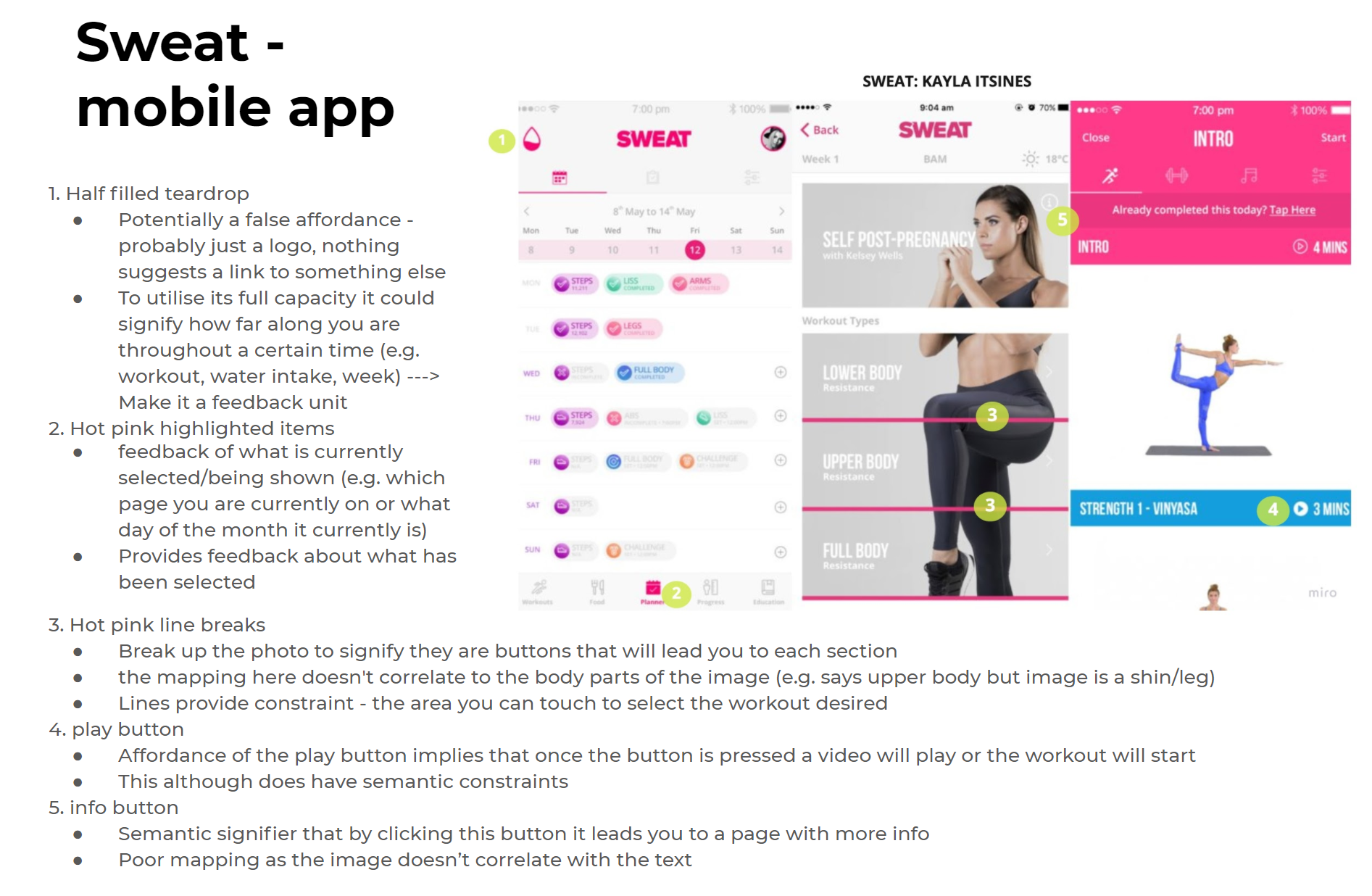
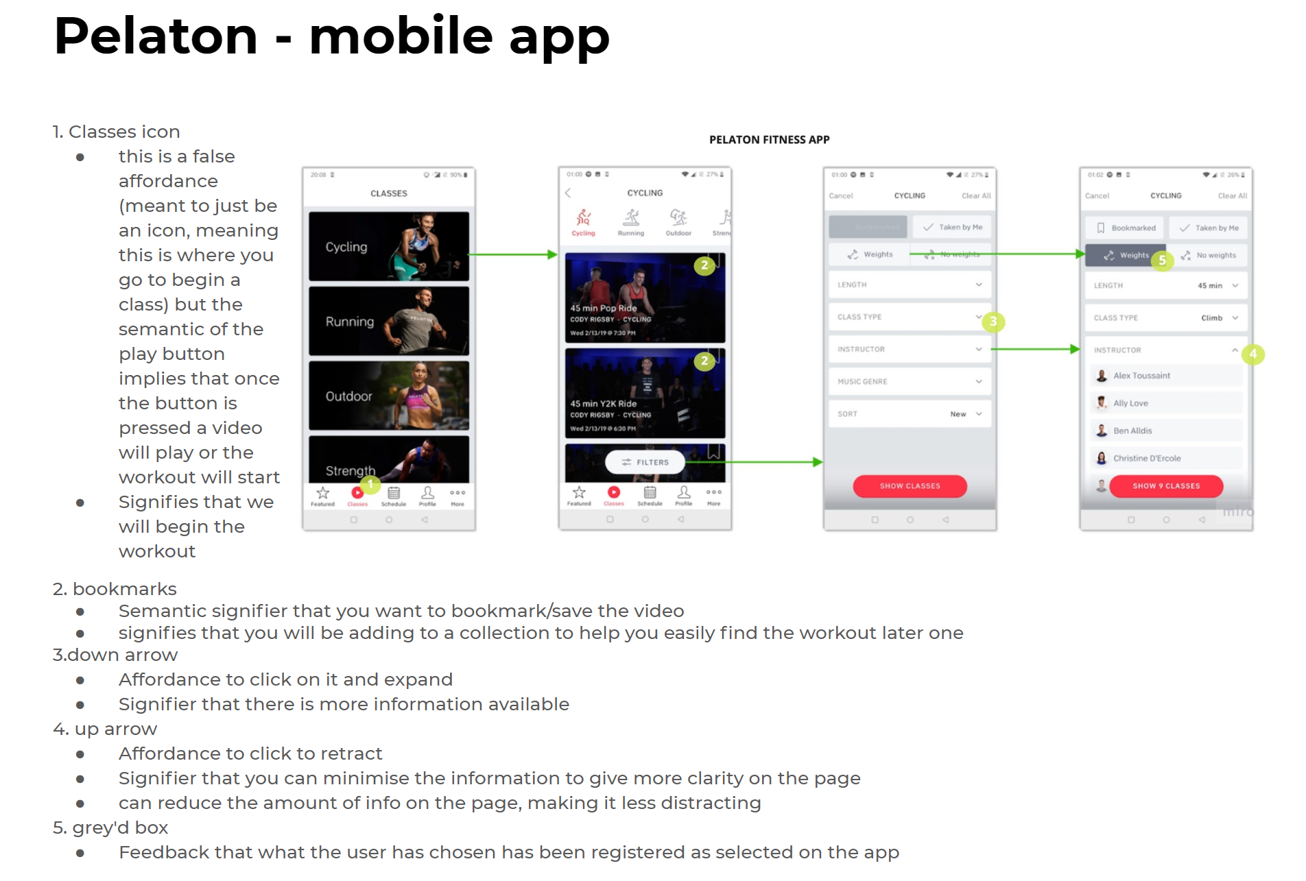
Interface Analysis
Using Don Norman (1988)’s principles of design (Yoo, 2020), we analysed existing interfaces to assess the key strengths and weaknesses of each. This allows us to see what interfaces currently offer and what features we should maintain or change. It will inform our later prototyping stages, as well as ideation in understanding what makes an effective yet unique interface.
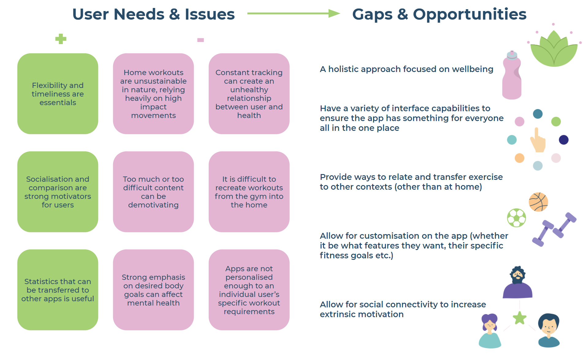
Key Findings
From all our research we were able to converge to a key problem area. Under this we identified 3 further problem areas that were a root cause of this problem area.
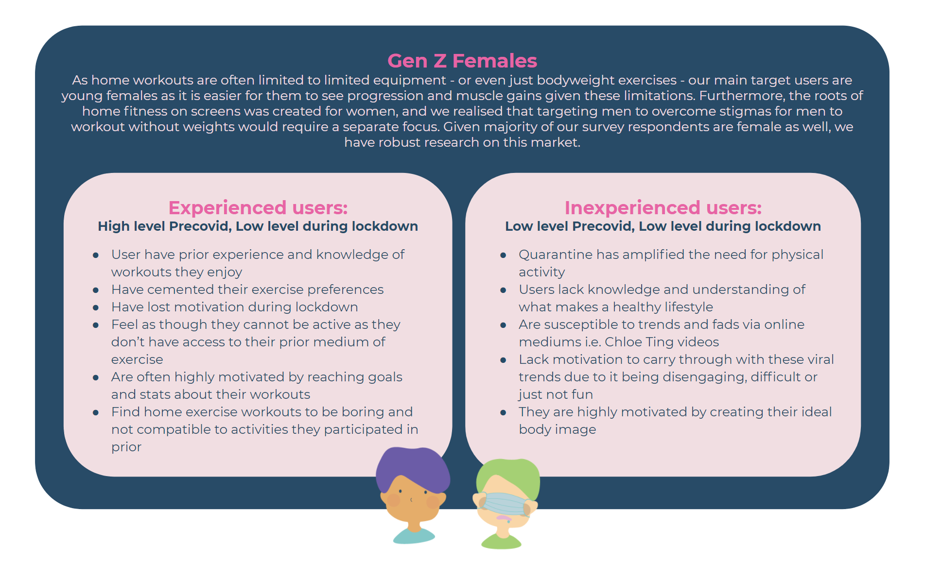
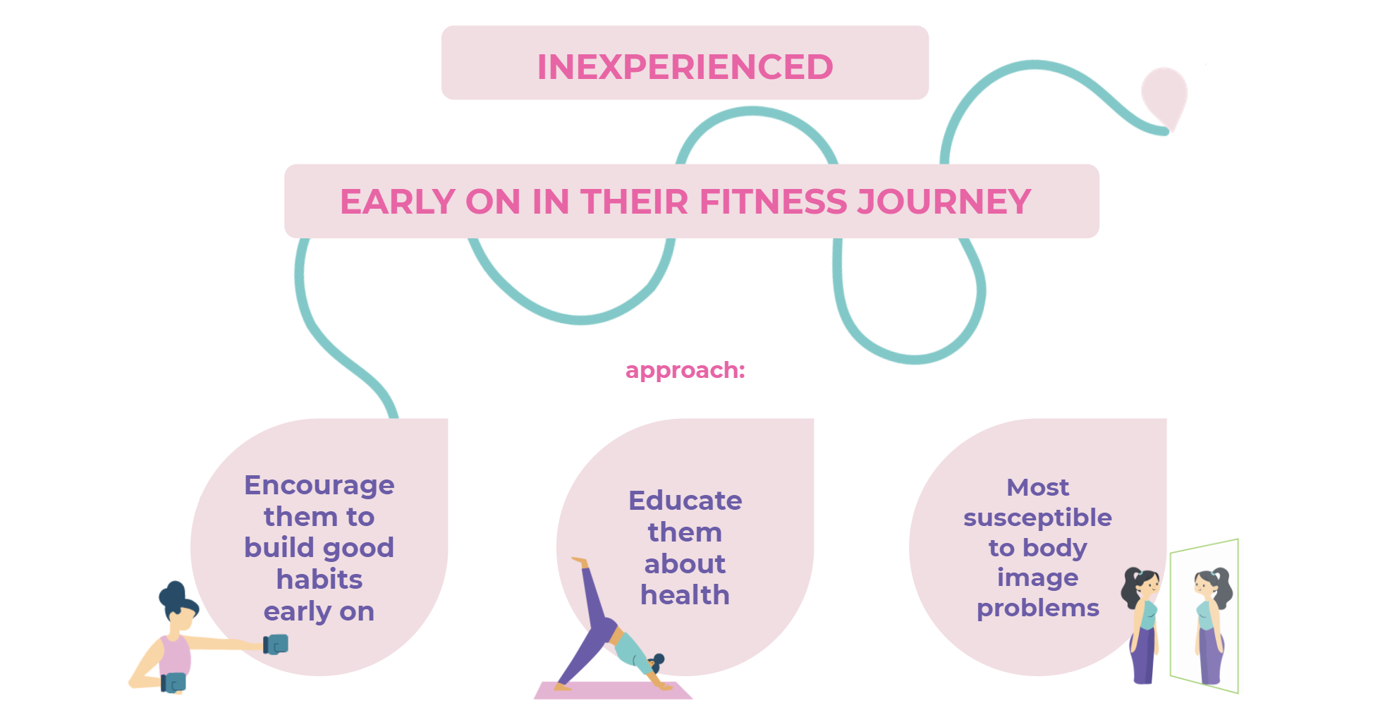
Target Audience
Based on our collected data, we identified the following user groups to be potential target markets for our interface.
We split this into experienced vs. inexperienced, and will choose one to move forward with in the next part of our process.
Concept Generation
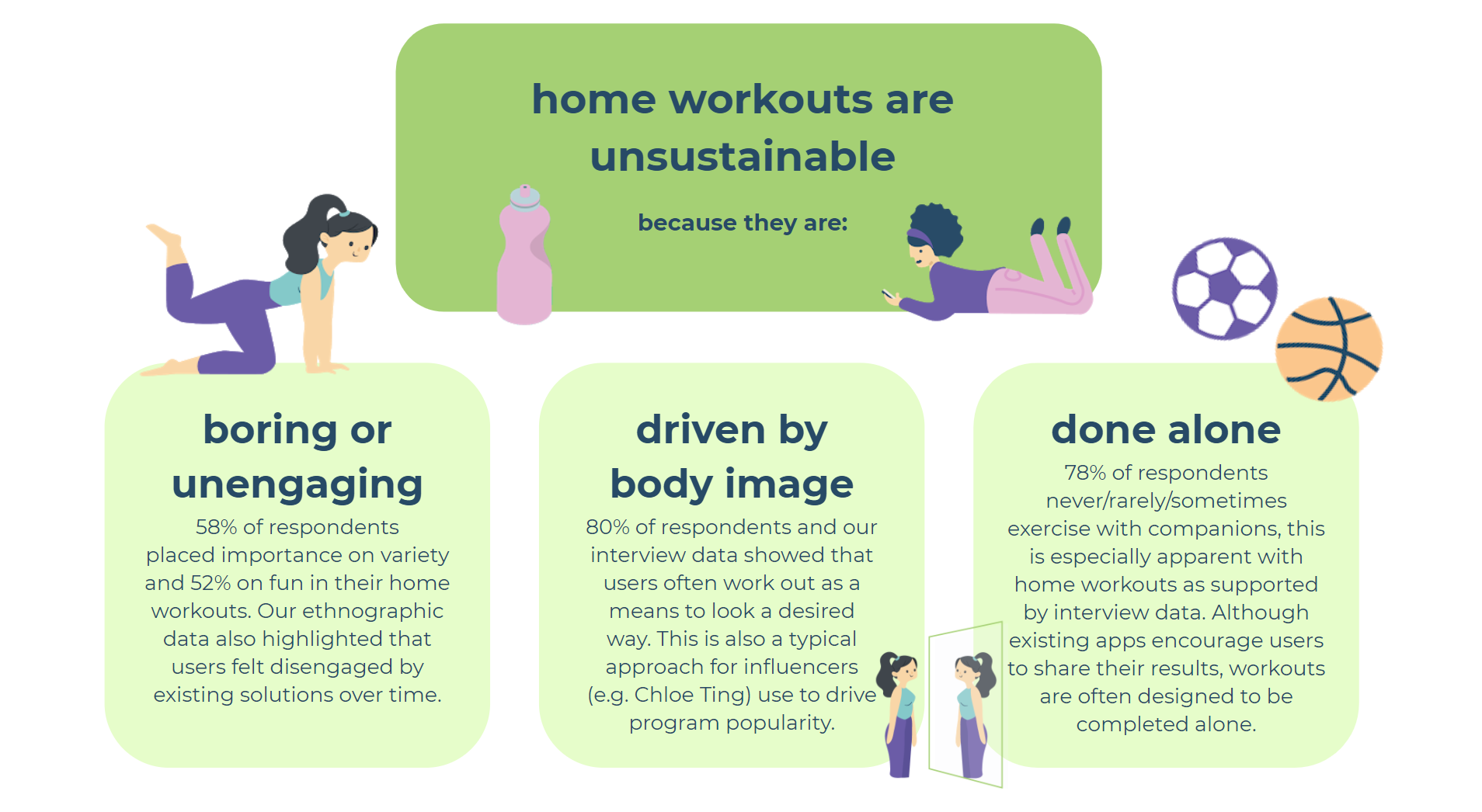
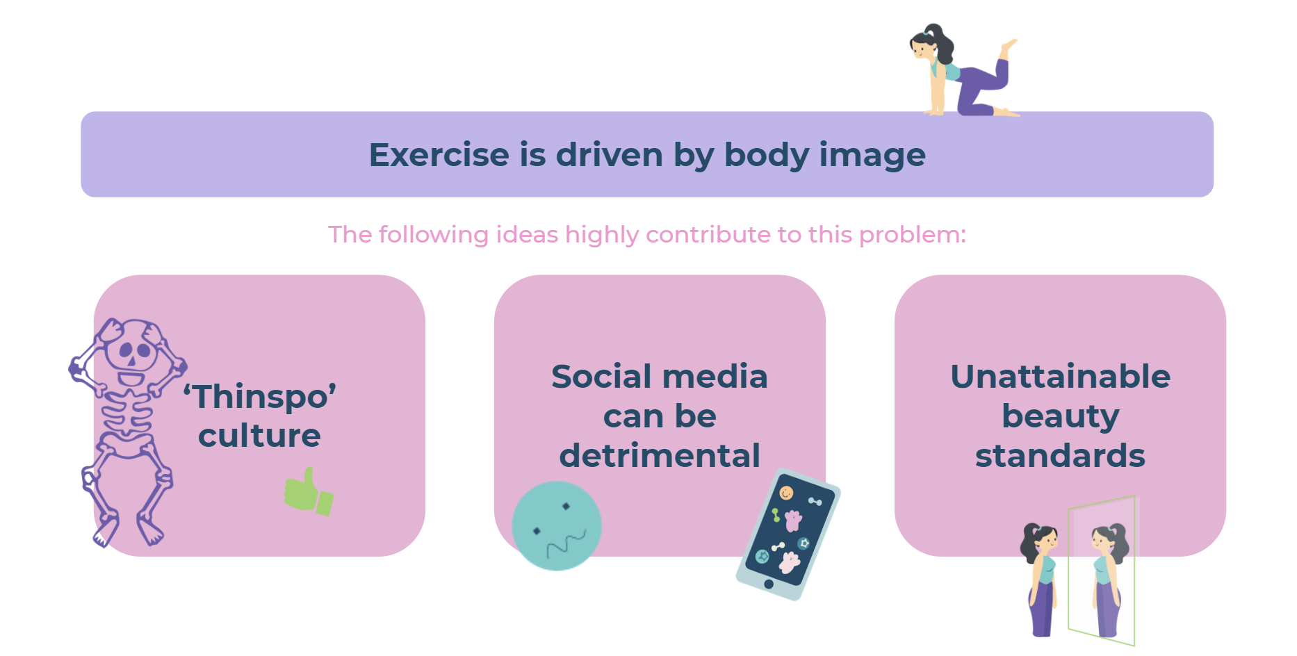
While exercise is undoubtedly vital in maintaining good physical health, we identified in our initial research that many users of home workouts are highly motivated by the pursuit of a certain body type, physique or weight. This type of motivation was discovered to be unsustainable in cementing long-term habits for exercising in quarantine.
We identified that this ideal was spurred from:
Unrealistic societal beauty ideals
Being encouraged by social media and the so-called ‘thinspo’ culture
Creating unattainable beauty standards for many users
Exercising for body image can form an unhealthy relationship between the individual and exercising, one which we endeavour to mitigate.
Therefore, we identified the following problem statement to summarise the issue our interface will respond to:
Home workouts are unsustainable as they are driven by a strive for the ‘perfect-looking body’ rather than health.
To further define our desired user, we hoped to target Gen Z females who are inexperienced with exercise, exhibiting low levels of fitness before and during COVID-19 lockdown.
Ideation
We then generated a total amount of 28 concepts using the ideation techniques Crazy 8 and Brain Writing 365. These techniques helped push the boundaries of obvious solutions into more unique, targeted and interesting ideas. They also gave us room to build off each other’s ideas, combining different successful elements to form more holistic concepts.


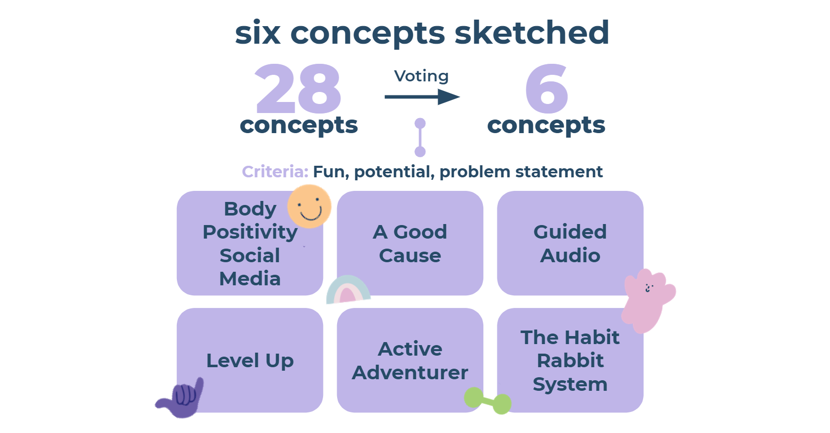
We narrowed these down to 6 concepts through voting, which we wanted to explore further. Criteria included:
How fun the concept was
A solution to the problem statement
Potential for the idea to be developed/evolve

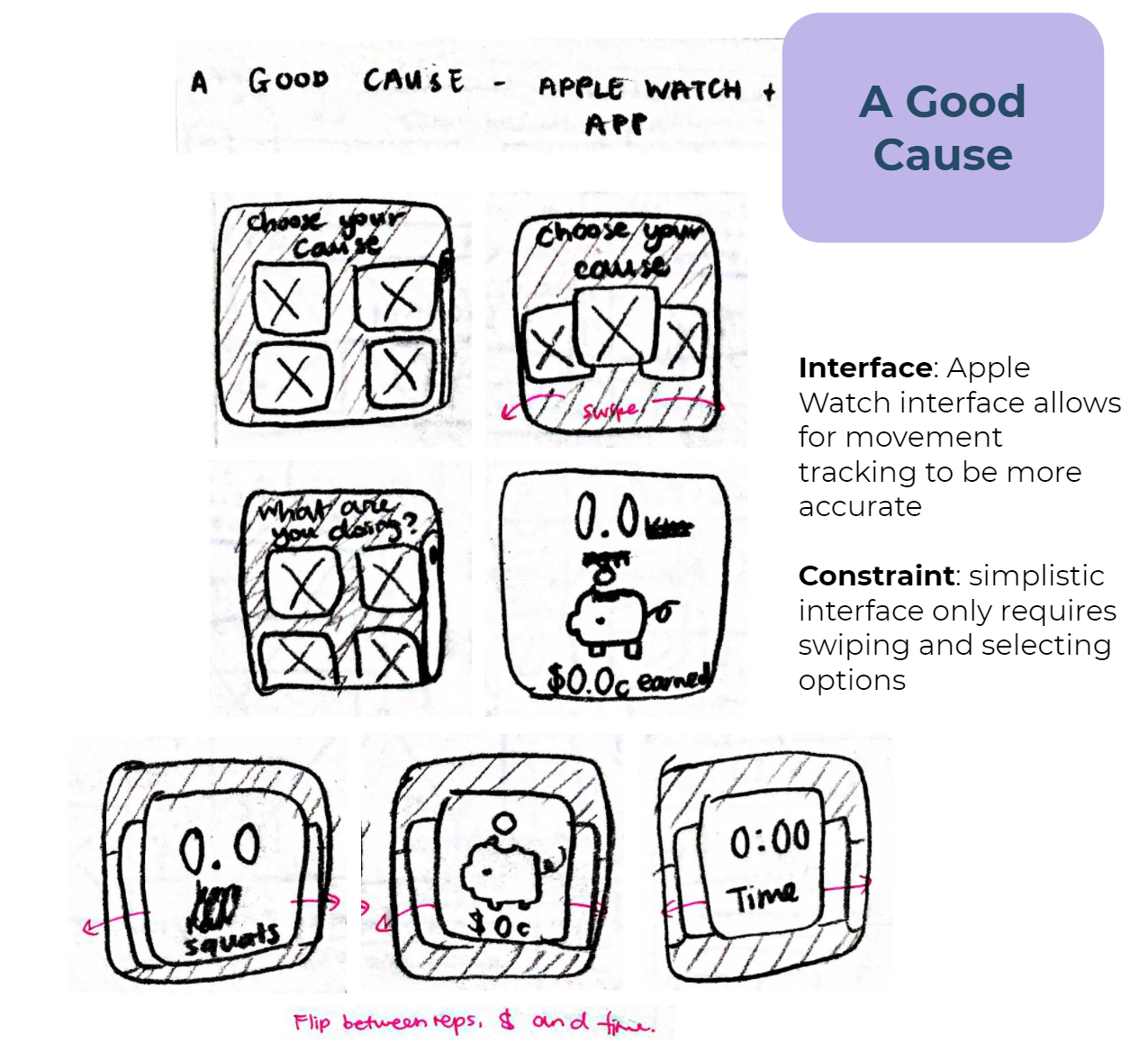
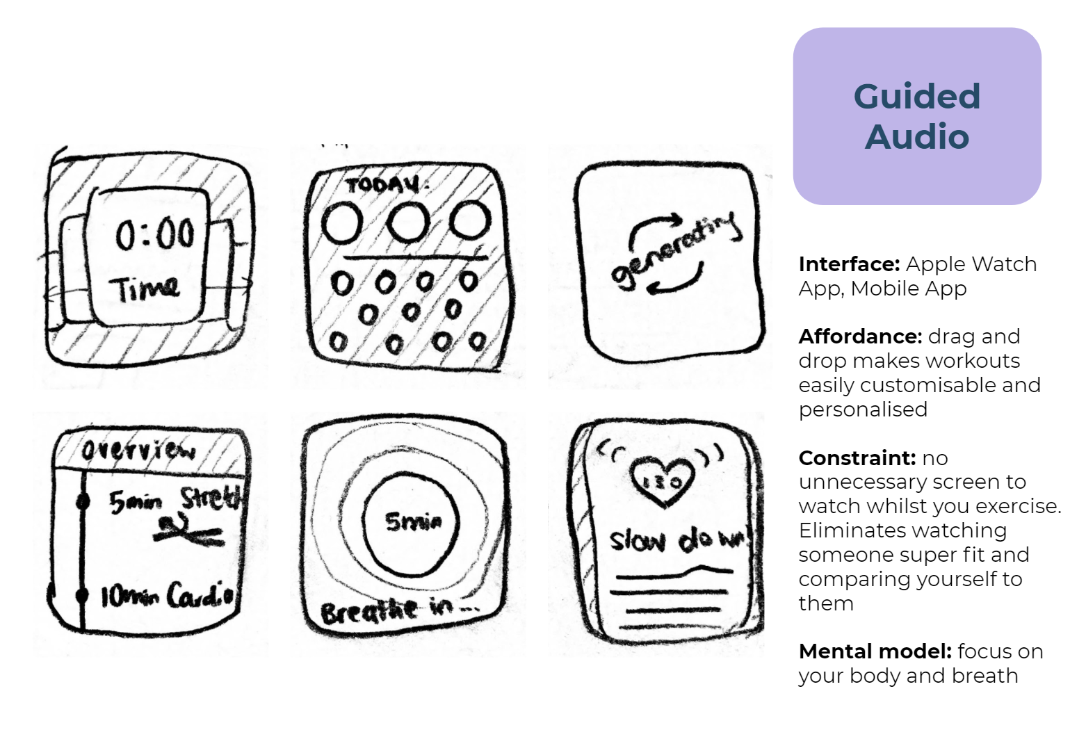
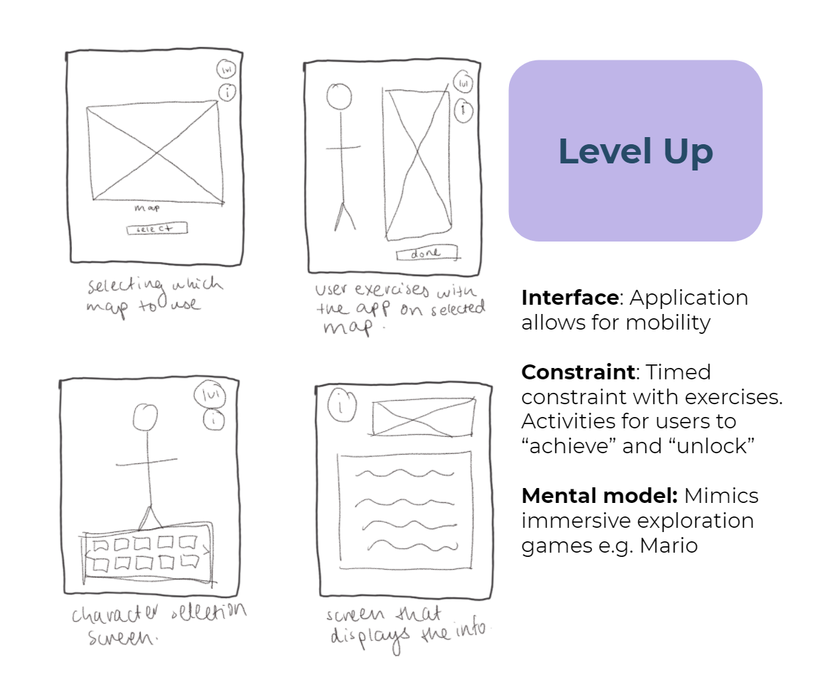
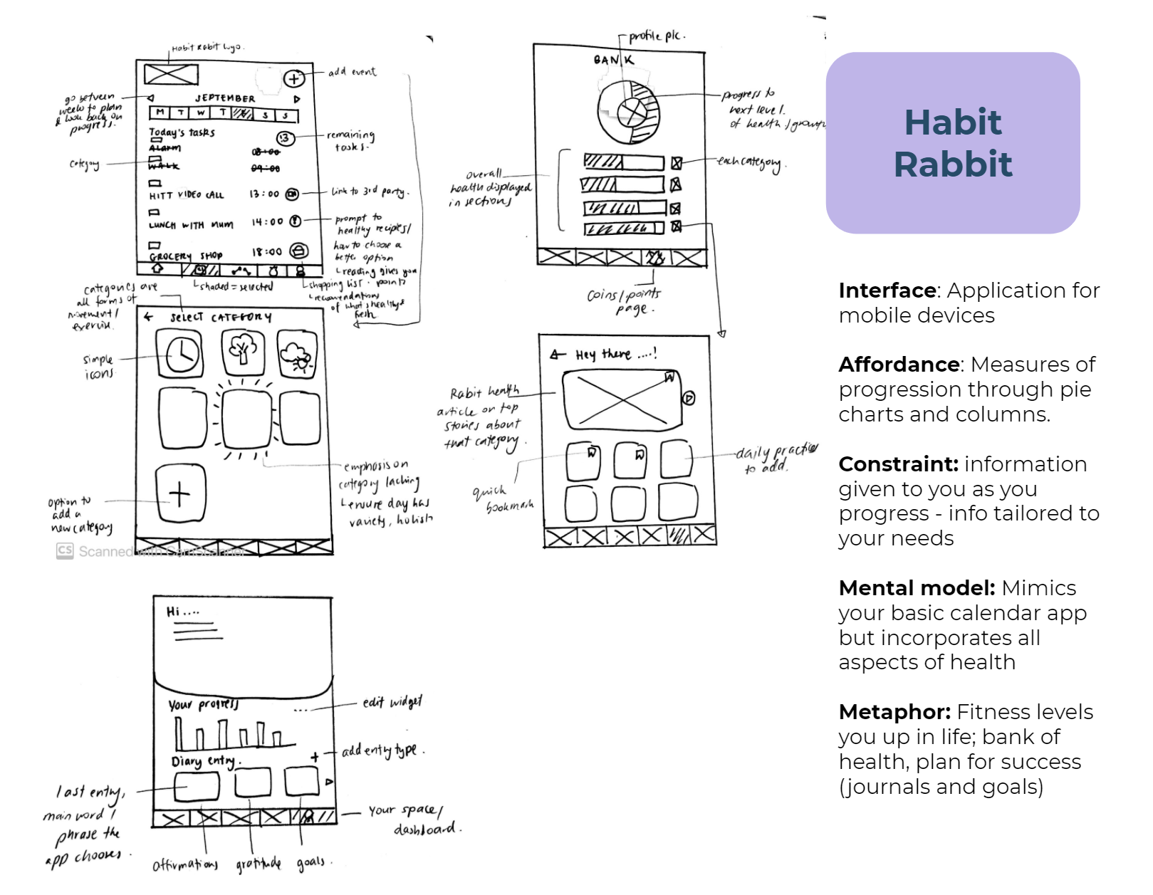
Low-Fidelity Mock-ups: Sketches
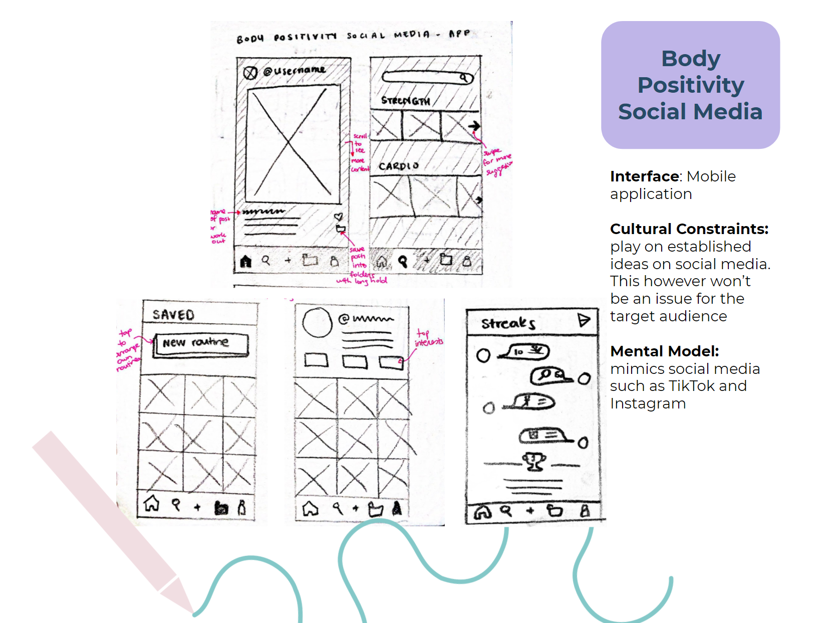
Evolved the ideas and communicated what we thought the concept would look like through screens, we conducted pencil and paper sketches to stretch our imagination and quickly sketch out ideas. The 6 concepts we carried forward were:
Decision Matrix
Based off key criteria central to our problem statement such as intuitive, driven by health and entertaining, we evaluated the 6 concepts to pick the top 3. The rational, quantitative approach made comparing the 6 concepts logical and easy.
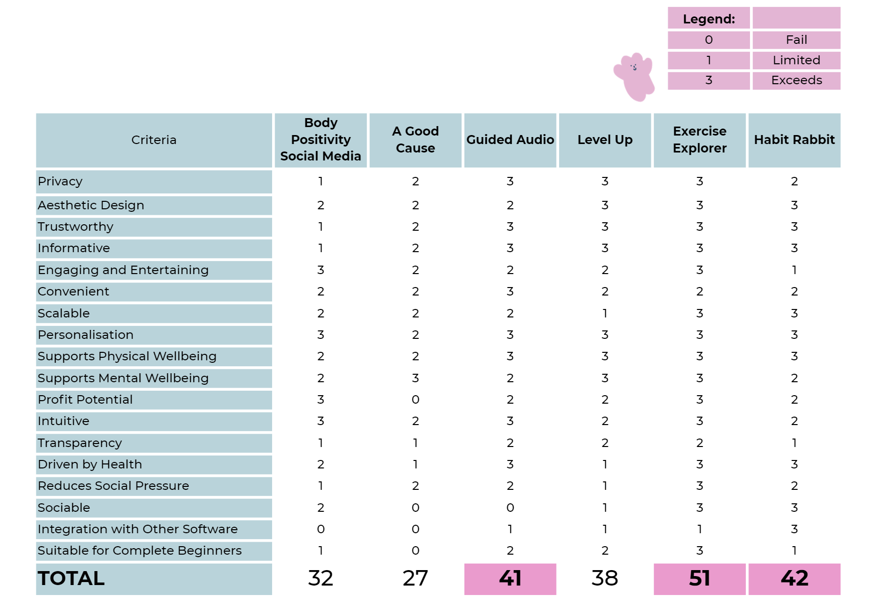
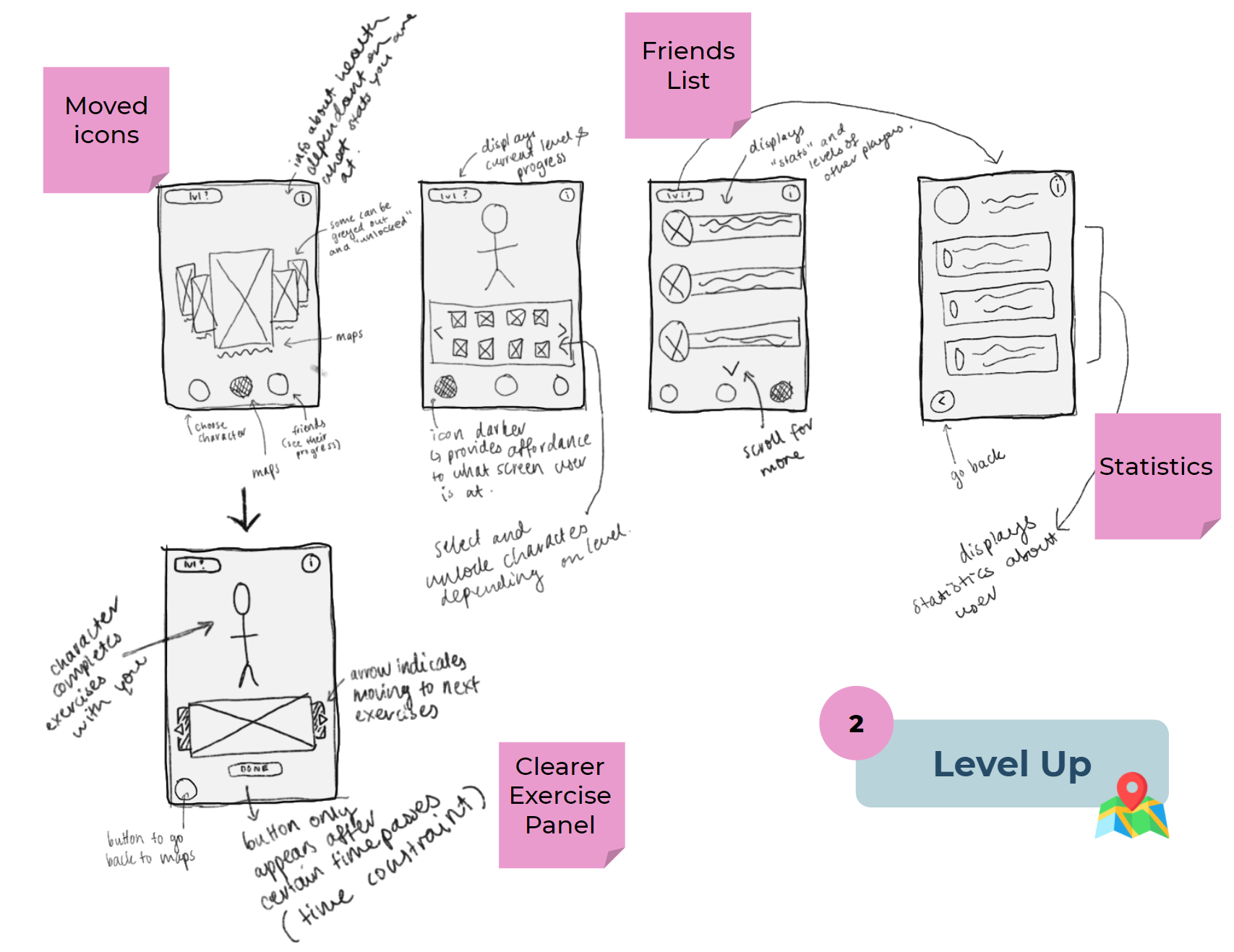
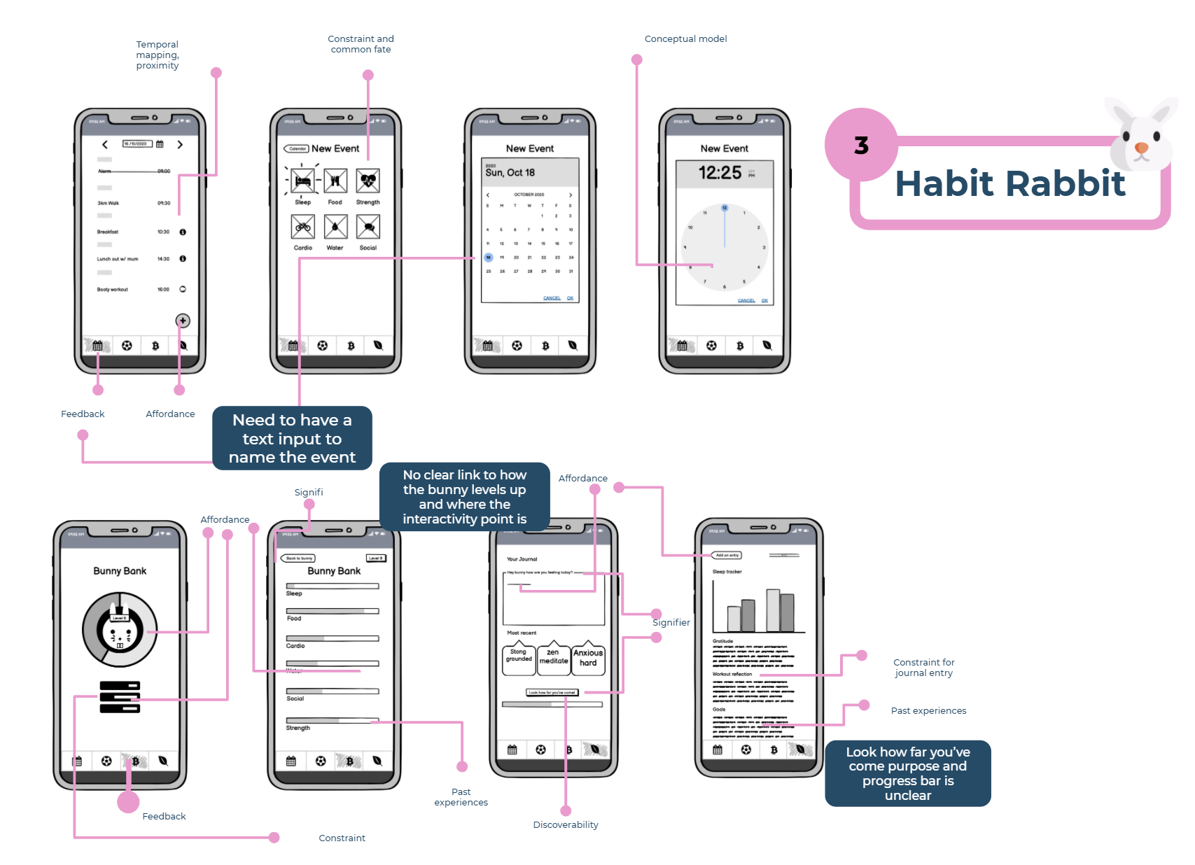
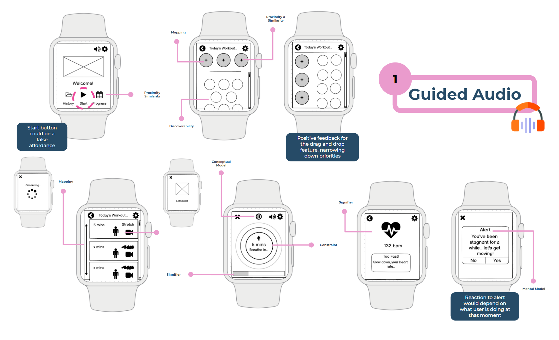
From the decision matrix, the three concepts we decided to carry forward to create lo-fi sketches were Guided Audio, Level Up and Habit Rabbit.
Informal peer feedback was implemented to develop the screens further before wireframing.
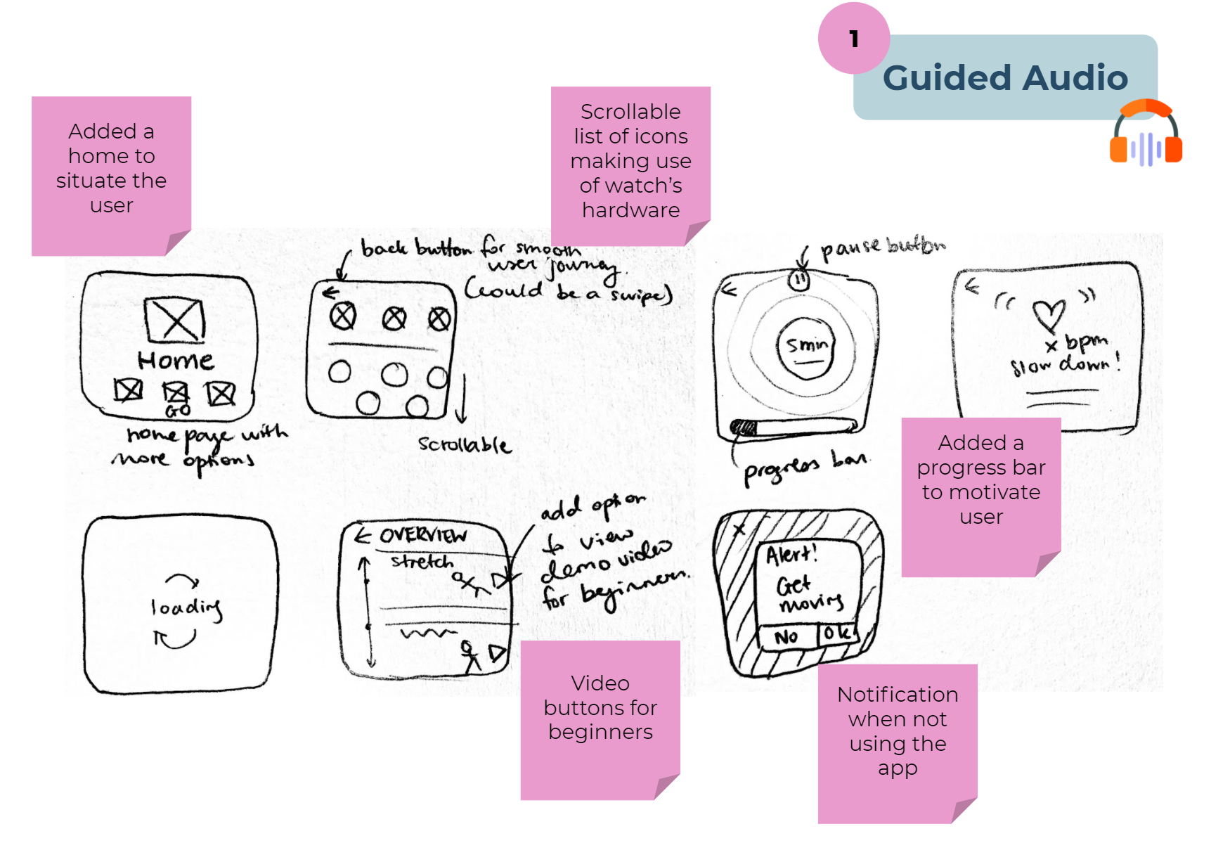
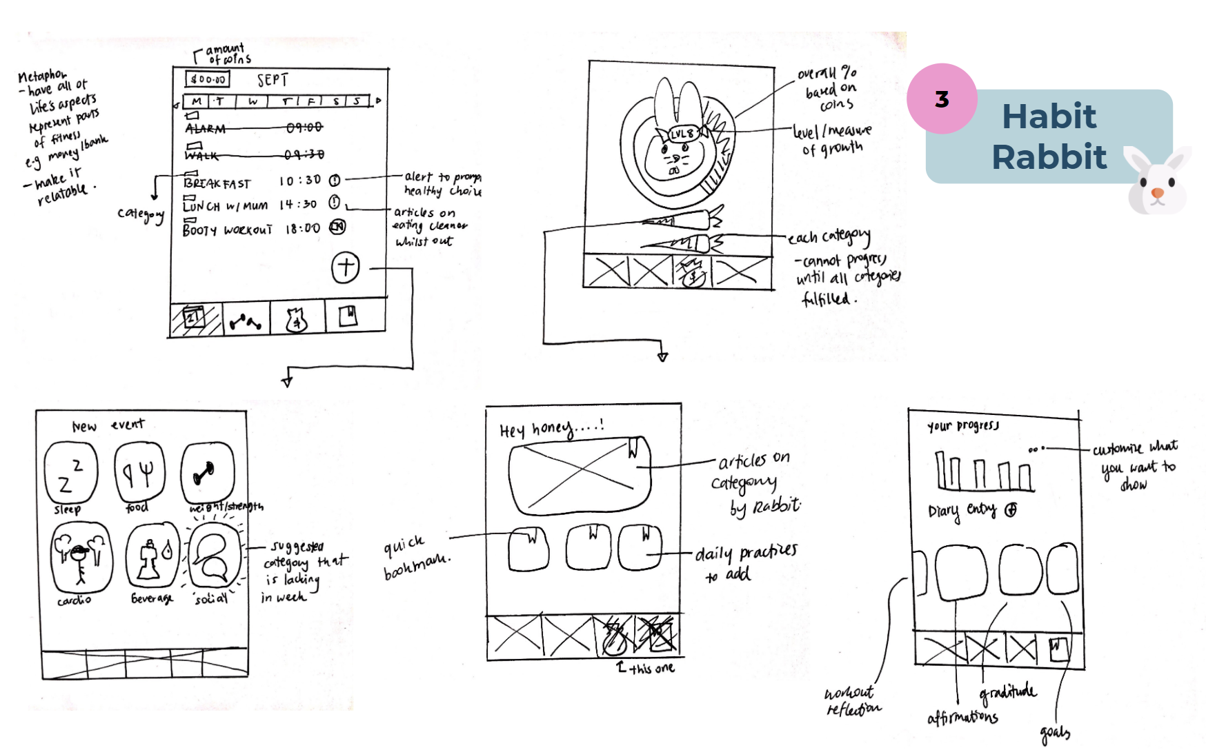
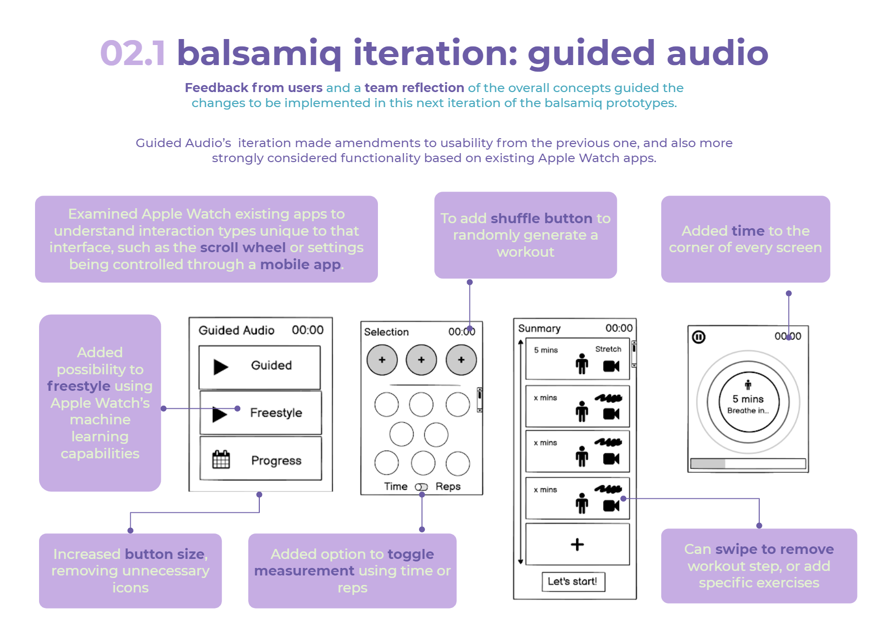
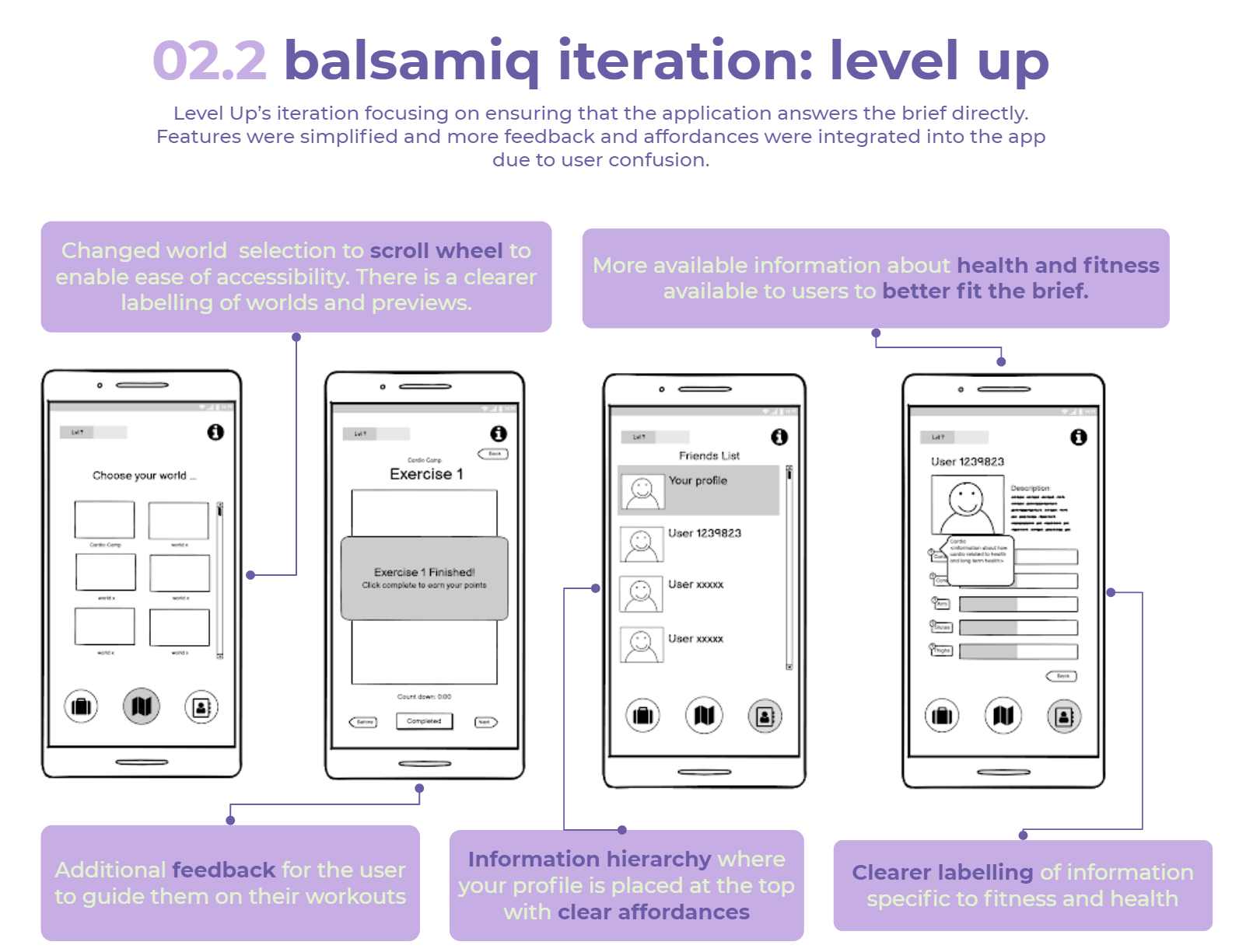
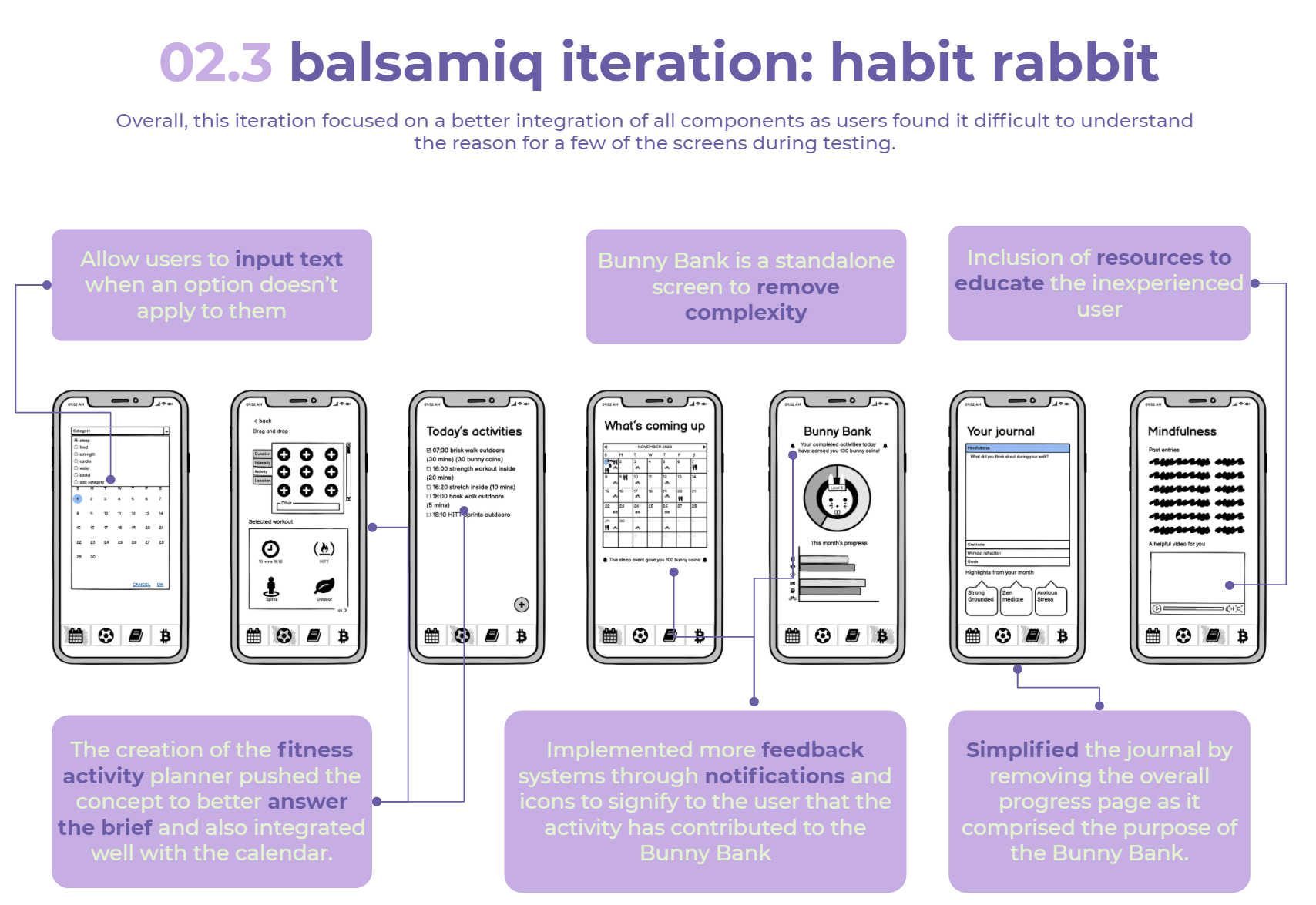
Low-Fidelity Mock-ups: Balsamiq Wireframes
We then used Balsamiq to flesh out our three chosen concepts as low-fi wireframes, providing clearer visualisations of our concepts. It also made user testing easier for a user to work their way through each screen. Don Norman’s Interaction Principles and Gestalt Laws are used to justify UI decisions.
User testing was conducted in this stage using Think Aloud via Zoom with 5 participants, indicating key improvements for the next stage.
Think Aloud User Testing
After refining the previous iteration, user testing was used again to evaluate the effectiveness, efficiency and satisfaction of the systems built for each of the three concepts (Yoo, 2020). We also wanted to ensure the transference of conceptual models of the user and our system was aligned.
Participants
Selected users were strategically chosen to best replicate our target audience of Gen Z females who are inexperienced and early on in their fitness journey. It was particularly important to state to the users that were are testing the product, not them as they are inexperienced beginners and may not understand jargon or terms specific to fitness. 9 participants were given 1 task each to complete.
Method
Think aloud protocol was used to understand what our participants were thinking about through verbalising their thoughts as they interacted with the system (Neilson, 2012). We tested low-fidelity prototypes created on Balsamiq. Further, SUS testing and Heuristic evaluation were internally conducted by the team for each concept’s Balsamiq screen to assess usability and bolster user testing through a rational scoring model.
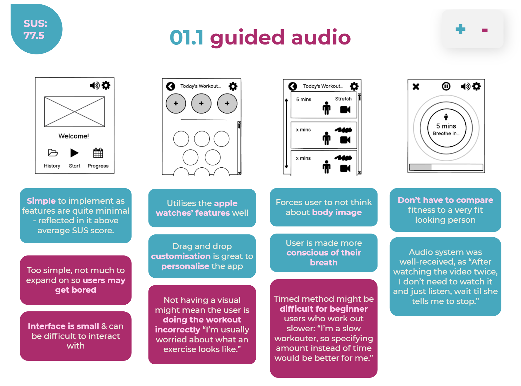
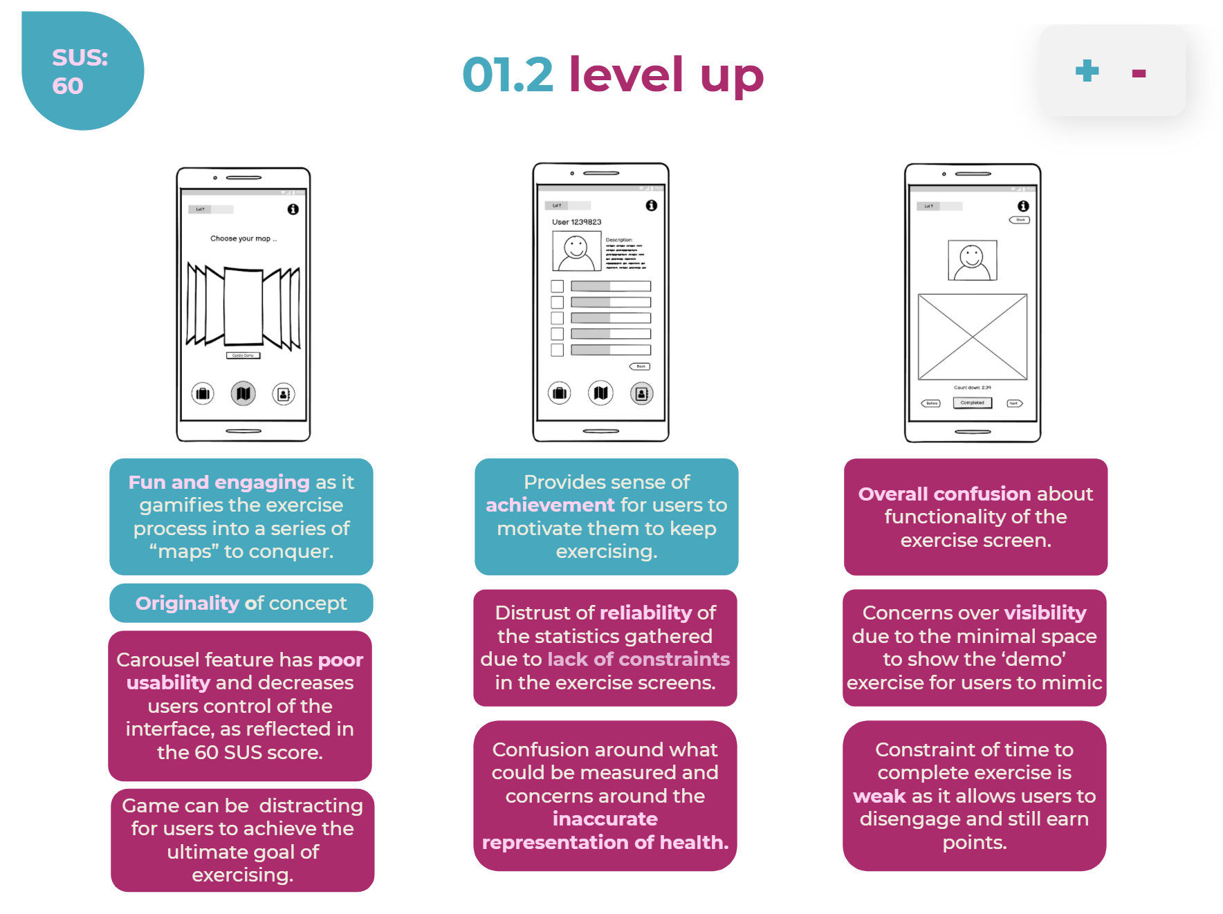
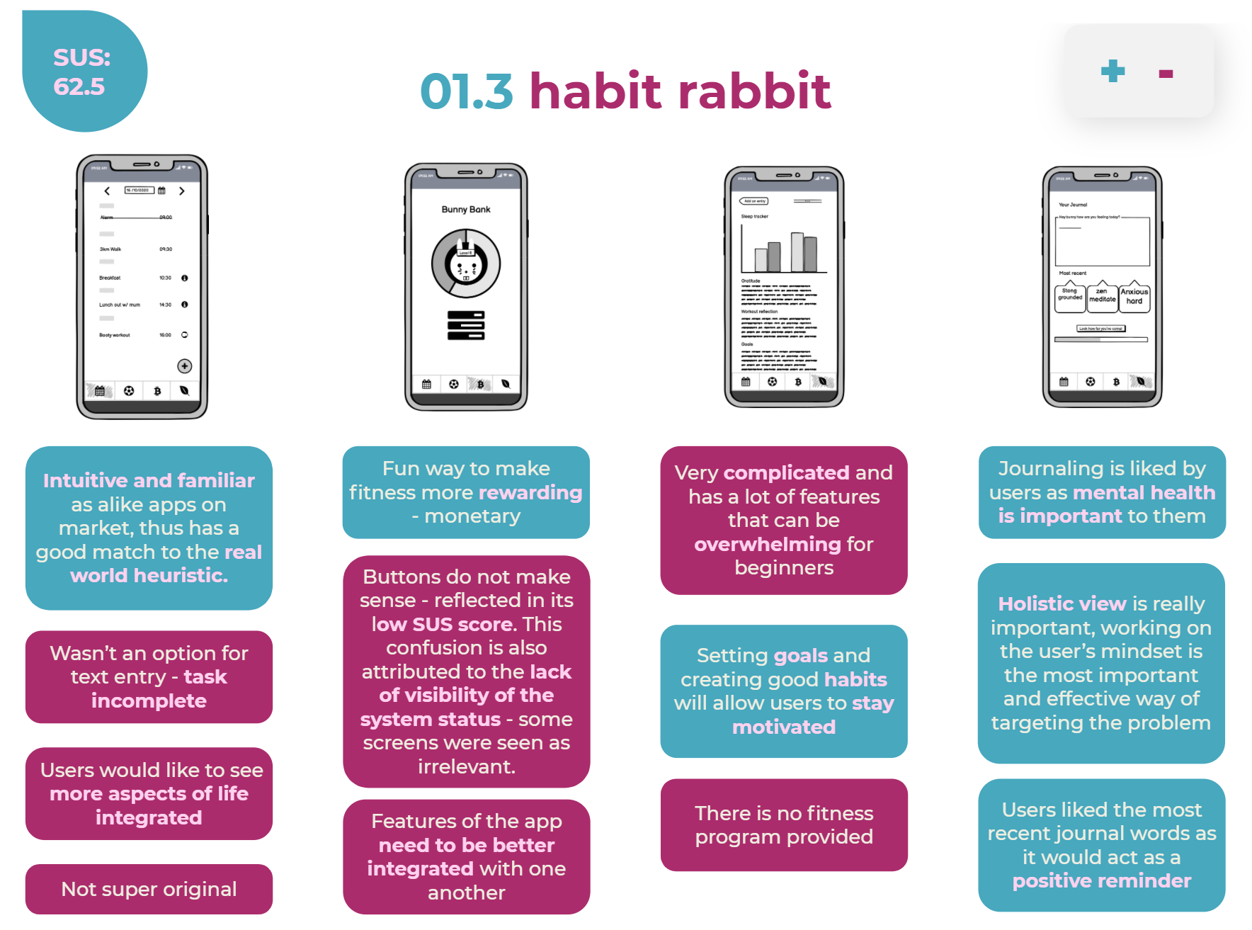
Chosen Concept
The evaluation matrix saw potential in both Guided Audio and Habit Rabbit. Combining the applications may overcome the limitations of each concept; Habit Rabbit was unoriginal and didn’t have a huge fitness focus - missing the brief; and Guided Audio was too simple - not having much to expand on due to the limitation of the Apple Watch's very small 38-44mm screen).
Conceptually bringing these concepts together was intuitive and allowed us to get the most out of each concept. Guided Audio takes the focus away from body image by avoiding comparison to the person demoing and Habit Rabbit can actually target the body image issue through getting users to internalise their feelings and emotions.

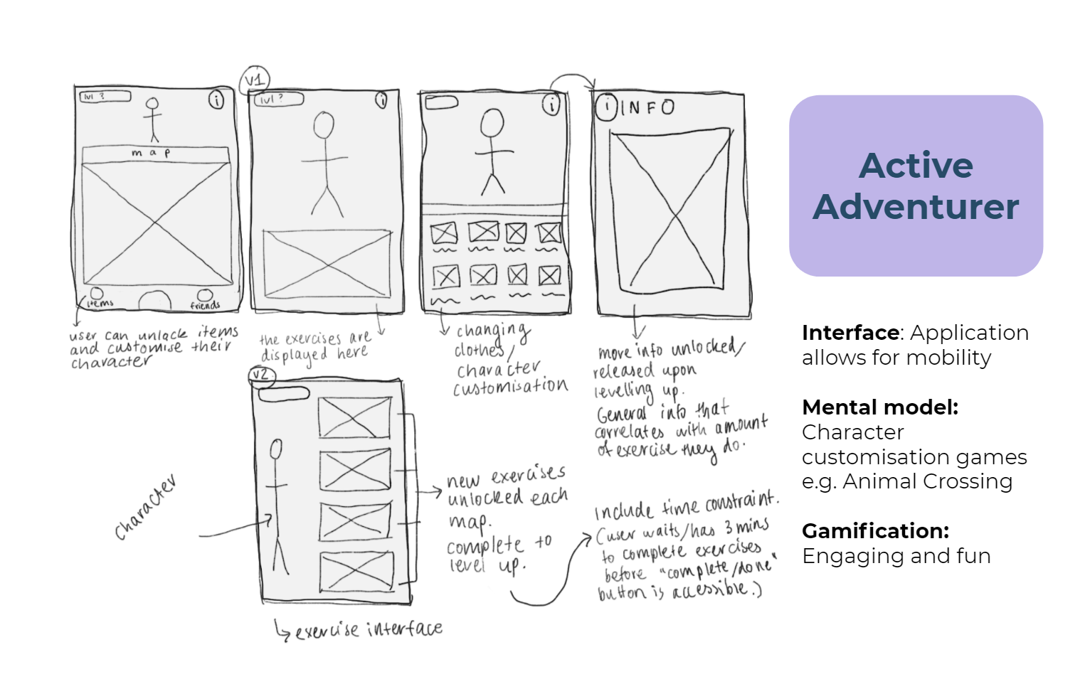
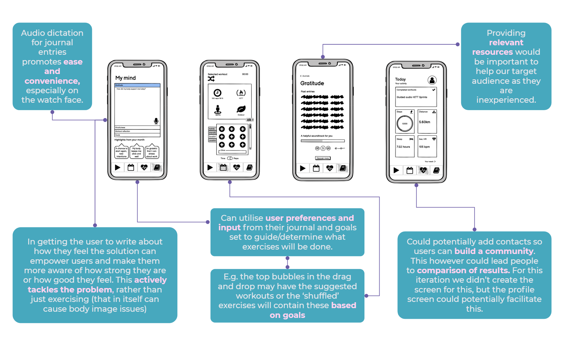
Additional Healix App Screens
This iteration focused on leveraging the full functions of each device and ensuring there was a use for both the iPhone and Apple Watch.
We also revisited the brief at this stage, verifying whether our solution was well suited to the problem at hand. We found that the apps allowed for flexibility and efficiency of use as the system can cater to both inexperienced and experienced users. We hope to have answered a problem relevant for any user that uses the platform. Furthermore the app allows for customisation which allows users to tailor frequent actions to their liking.
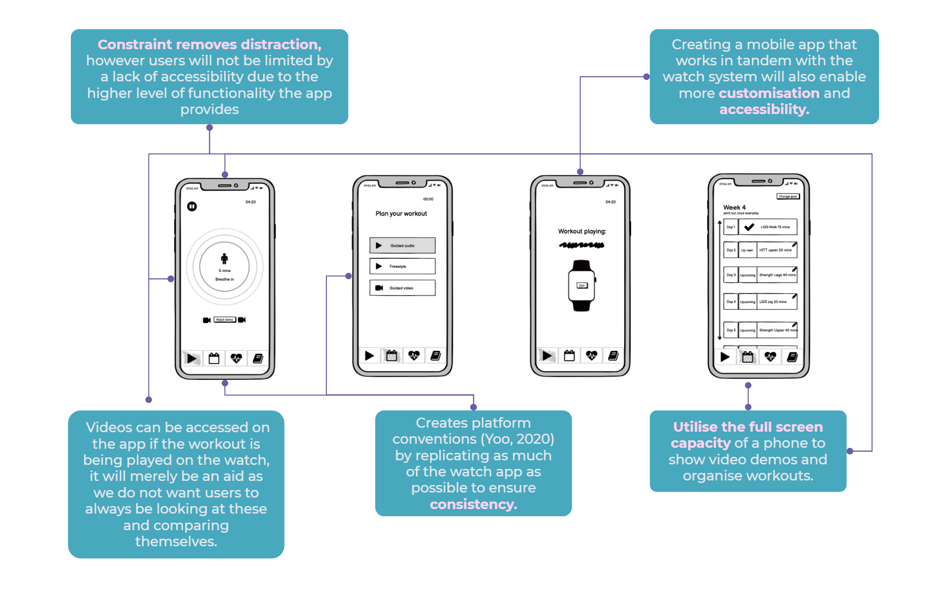
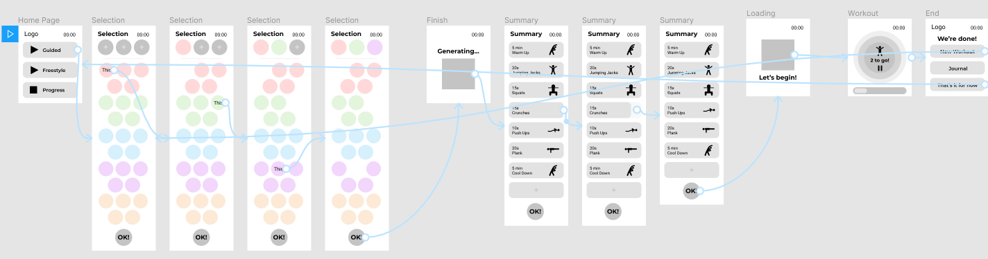
Flow Charts
Flow charts were then created for both the Apple Watch and mobile app, linking together the different screens and sections that would create our interfaces. This approach of systems thinking offered the following benefits:
Ensure that we understood how both the platforms would be used in tandem
Illustrate the main flow between screens (Yoo, 2020); if the user clicks a button where will it take them?
Helped us ideate - figure out if screens were useful in the overall concept, helped us understand the purpose of a screen and how it affects another
Show alternate paths
Enables smooth collaboration between the 3 designers so we have the same understanding of the user journey.

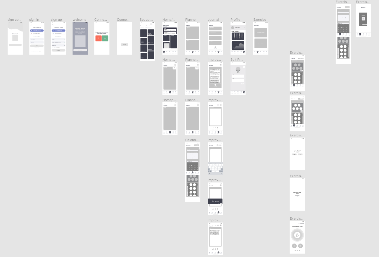
High-Fidelity Prototype: Iteration 1
By moving away from wireframing through Balsamiq and onto prototyping on Figma, we increase the fidelity and introduced interactivity to our apps. As such creating realistic interface designs and interactions on Figma provided an immersive, realistic experience for users to interact with in our usability testing. For this first round of iteration, we mostly copied over our Balsamiq screens and added small elements of interactivity.
Mobile App
This iteration focused on implemented the changes identified from our wireframing and increasing usability. Connectivity to the Apple Watch was kept at the forefront. Gestalt laws of proximity and closure (Yoo, 2020) were also used to convey information easily to users and also imply they needed to scroll.
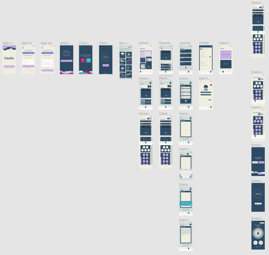
High-Fidelity Prototype: Iteration 2
Styling was developed through group voting and discussion. The following guide was made to ensure platform consistency (Yoo, 2020) between devices, as we needed to design for two types of screens, we wanted to employ a minimal style.
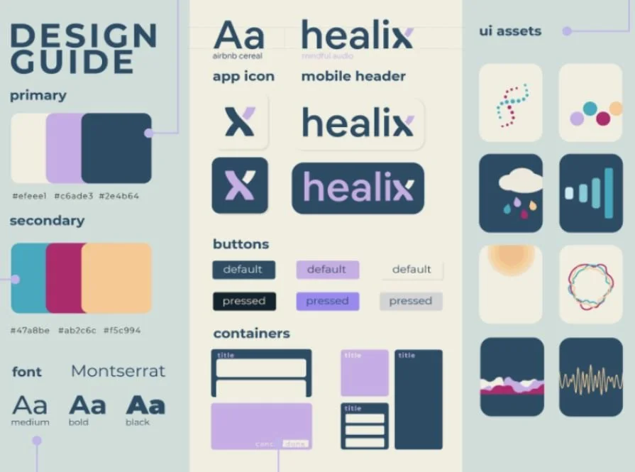
Branding Development
We brainstormed and eventually came up with the name “Healix”, a play on words to suggest the helix (part of the ear), the DNA structure, along with “healing” a relationship with one’s body.
A style guide was made to ensure platform consistency between devices. As we needed to design for two types of screens, we wanted to keep it very minimal so it could appeal to any screen we created. We used high-contrast colours and a web-safe sans serif font. The overall branding direction was to look approachable for beginners.

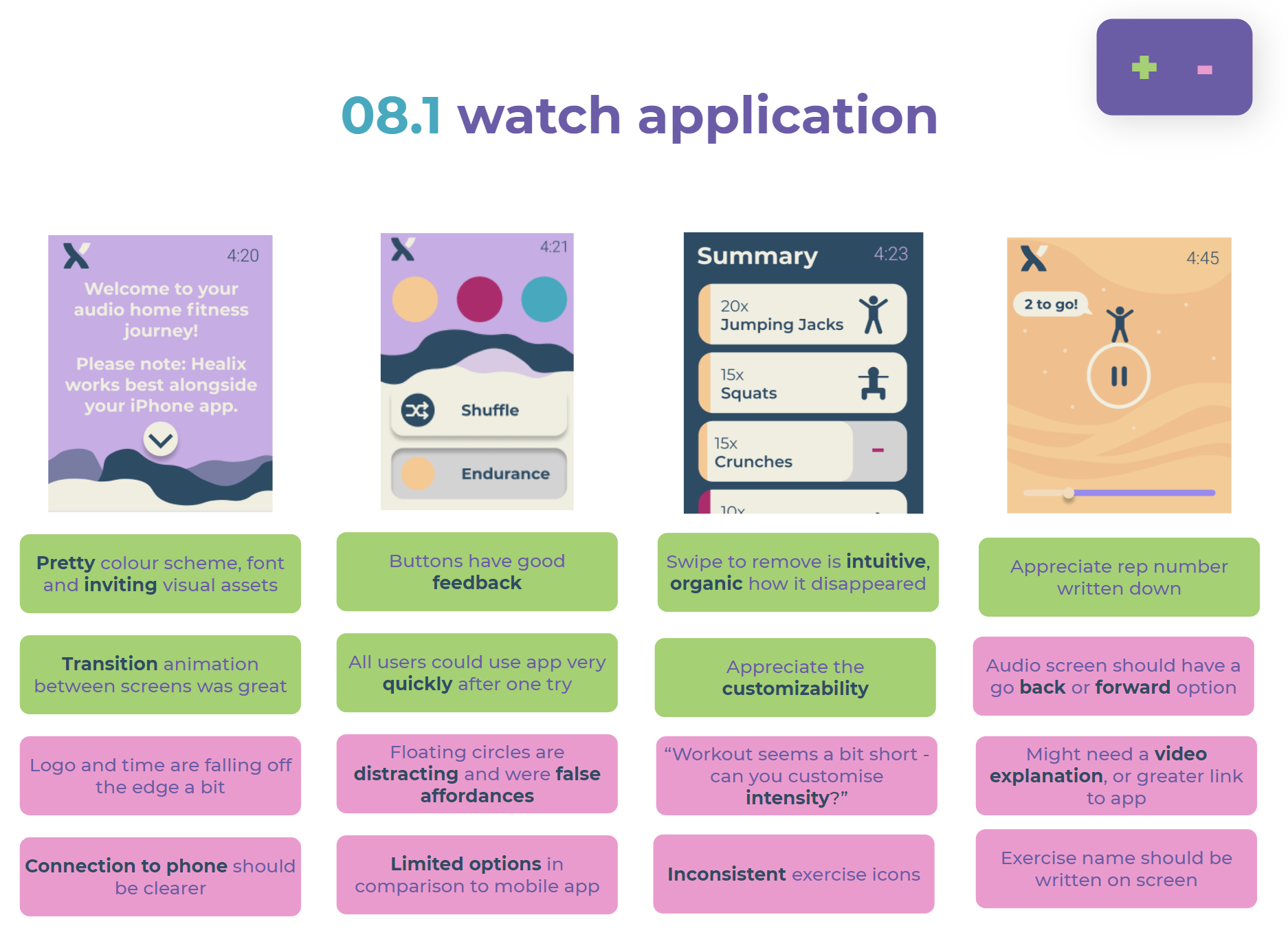
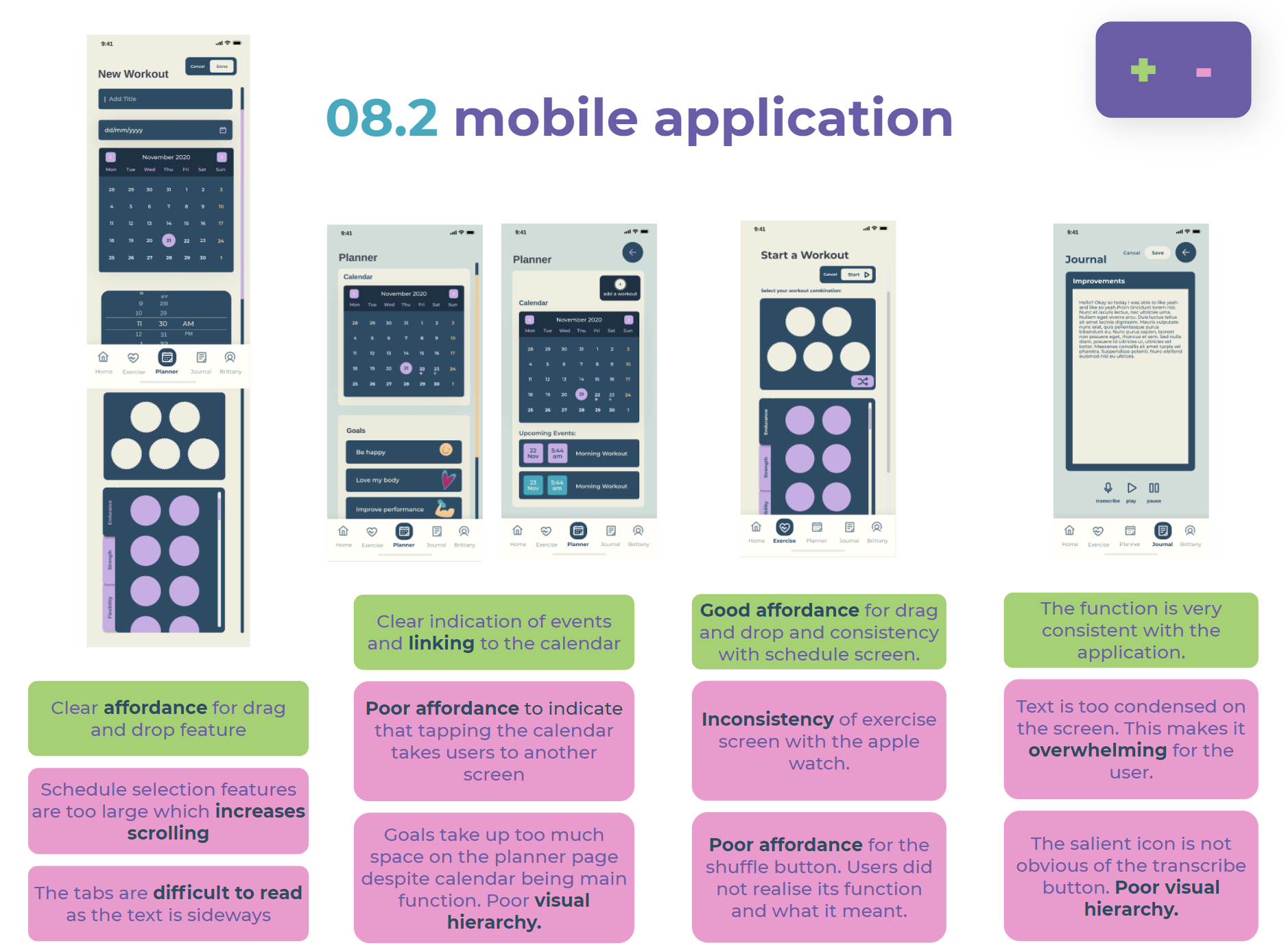
User Testing (High Fidelity Prototypes)
User testing was conducted in order to determine issues in interactions, user flow and behaviours (Ibragimova, 2016).
Think Aloud
5 participants underwent 3 tasks on the mobile app and 2 tasks on the watch.
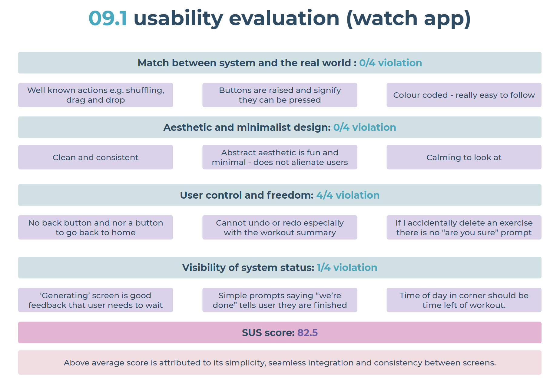
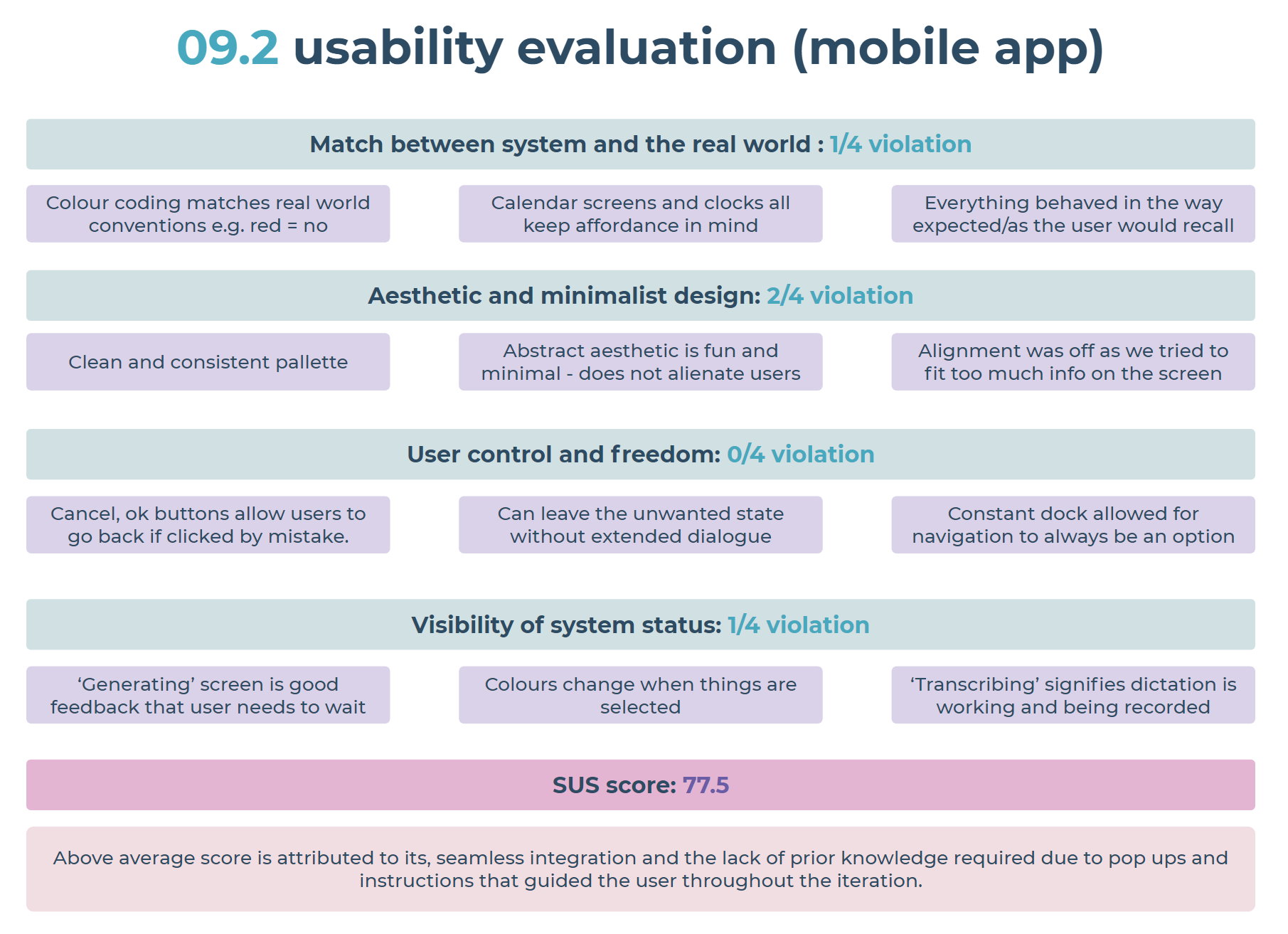
Usability Evaluation
Evaluation was completed based on the system’s extent of violation against Neilson’s (2012) heuristics for UI design. This, alongside SUS scoring from users provided a rational means to bolster the insights gained from user testing.
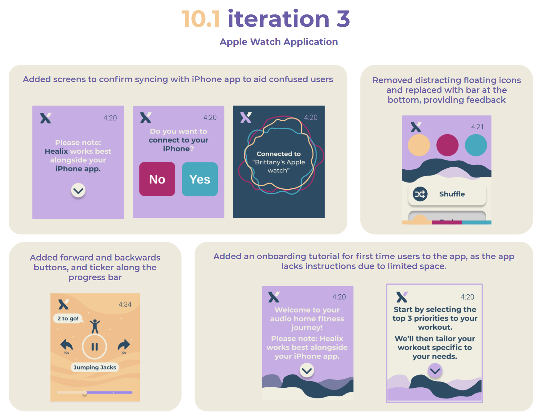
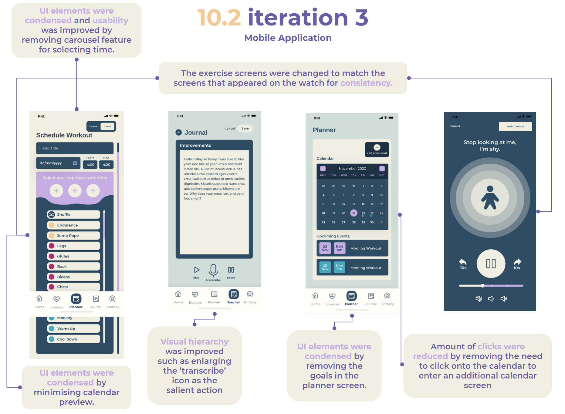
High-Fidelity Prototype: Iteration 3
At last, we have reached a high-quality stage of iteration that we are content to present, having integrated all previous feedback and enhancing the user experience. Styling was developed through group voting and discussion. The following guide was made to ensure platform consistency (Yoo, 2020) between devices, as we needed to design for two types of screens, we wanted to employ a minimal style.


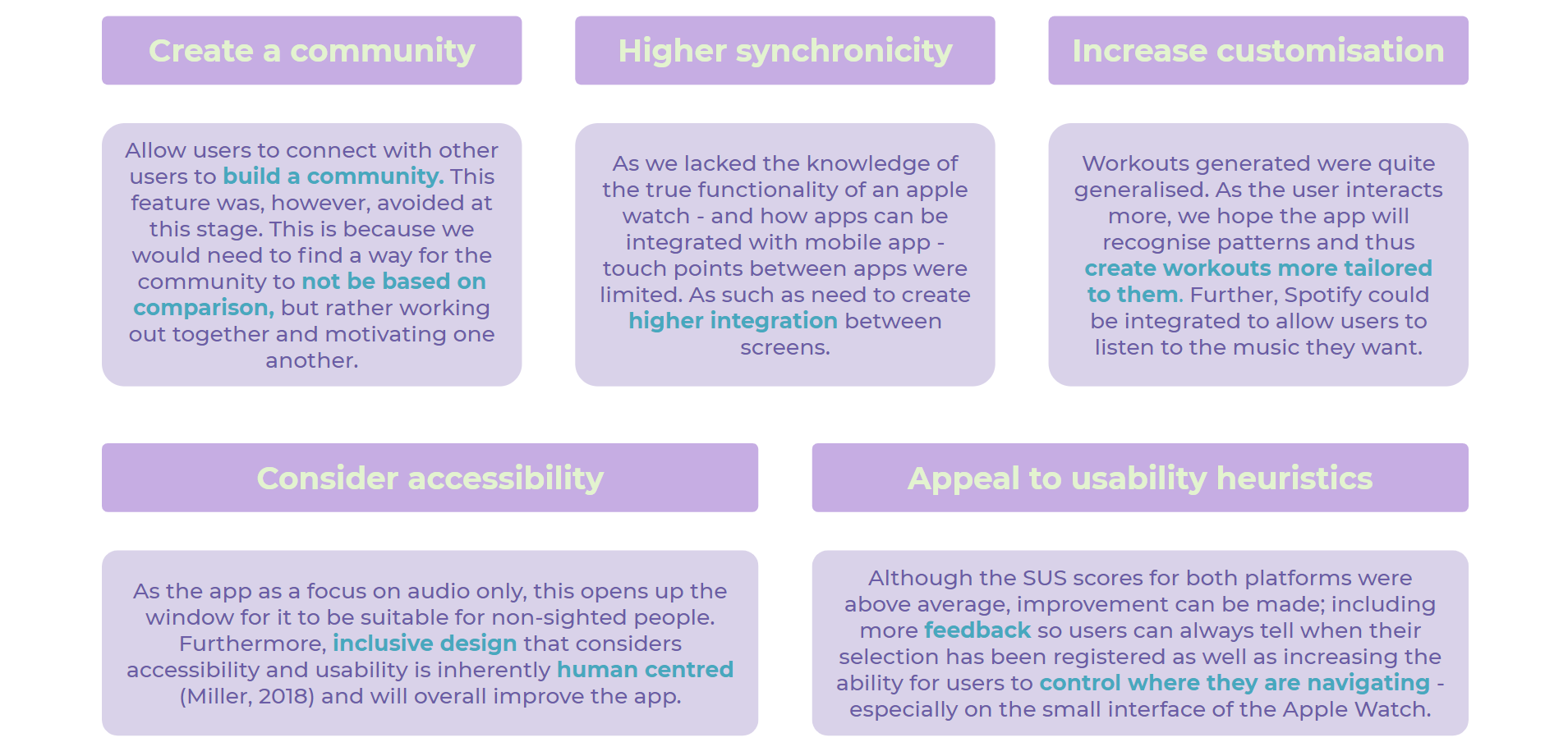
Future Features
Upon feedback from users and evaluation from heuristic and usability testing, we found many areas of improvement which can be made to increase the functionality of the apps. As we highly value inclusive design, we designed the solution to be appealing not only to our target market, but any user who would be interested.
References
Ibragimova, E. (2016). High-fidelity prototyping: What, When, Why and How?. Prototypr. Retrieved 10 November 2020, from https://blog.prototypr.io/high-fidelity-prototyping-what-when-why-and-how-f5bbde6a7fd4.
Miller, J. (2018). Inclusive Design and Accessibility. Retrieved 15 November 2020, from https://blog.prototypr.io/inclusive-design-and-accessibility-50718a3ac768
National Institute on Aging. (n.d.). Four Types of Exercise Can Improve Your Health and Physical Ability. Retrieved 15 November 2020, from https://www.nia.nih.gov/health/four-types-exercise-can-improve-your-health-and-physical-ability#:~:text=Research%20has%20shown%20that%20it's,boredom%20and%20risk%20of%20injury.
Neilson, J. (2012). Usability 101: Introduction to Usability. Nielsen Norman Group.
Neilson, J. (2012). Thinking Aloud: The #1 Usability Tool. Nielsen Norman Group.
Norman, D. (1988). The design of everyday things. Basic Books.
Soegaard, M. (2020). Laws of Proximity, Uniform Connectedness, and Continuation – Gestalt Principles (2). Retrieved 18 October 2020, from https://www.interaction-design.org/literature/article/laws-of-proximity-uniform-connectedness-and-continuation-gestalt-principles-2
Tomitsch, M., Wrigley, C., Borthwick, M., Ahmadpour, N., Frawley, J., & Kocaballi, A. et al. (2018). Design. Think. Make. Break. Repeat. A Handbook of Methods. Amsterdam: BIS Publishers.
Yoo, S. (2020). Interface Design Principles. Personal Collection of S. Yoo, University of Sydney, Sydney NSW.