
UNICEF Logo Redesign + Visual Communications
Brief: Produce your own re-branding for a company that supplies a product, experience or service.
Project Duration: 6 weeks
Tools: Adobe Illustrator, Photoshop & InDesign
The United Nations Children Fund is an organisation that promotes the rights and wellbeing of children. They have 5 priority areas (UNICEF, 2019):
Background Research


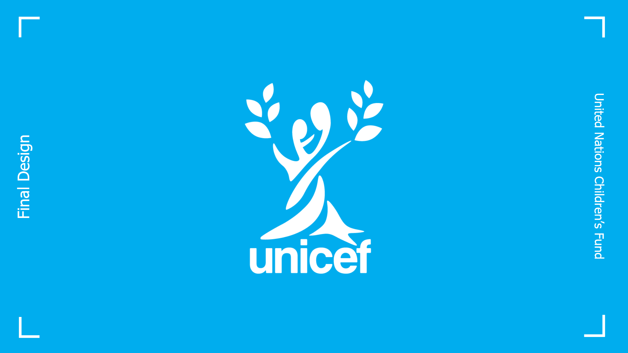
The current logo was then analysed from a symbolic and design perspective.
Current branding guidelines state that the brand style differentiates itself by being Simple, Optimistic, Bold and Contemporary.
UNICEF's logo represents unification and standing for children. This logo redesign aims to maintain all these values, while still creating a memorable and impactful design.
Primary Research
Primary research in the form of a questionnaire was also conducted to uncover existing brand recognition of the UNICEF logo. Key findings from the 71 participants were:
56% were mistaken in identifying the brand from the logo, where almost all those mistaken thought it was a different UN agency.
On average, the sample only ‘somewhat liked’ the current logo.
Moodboard
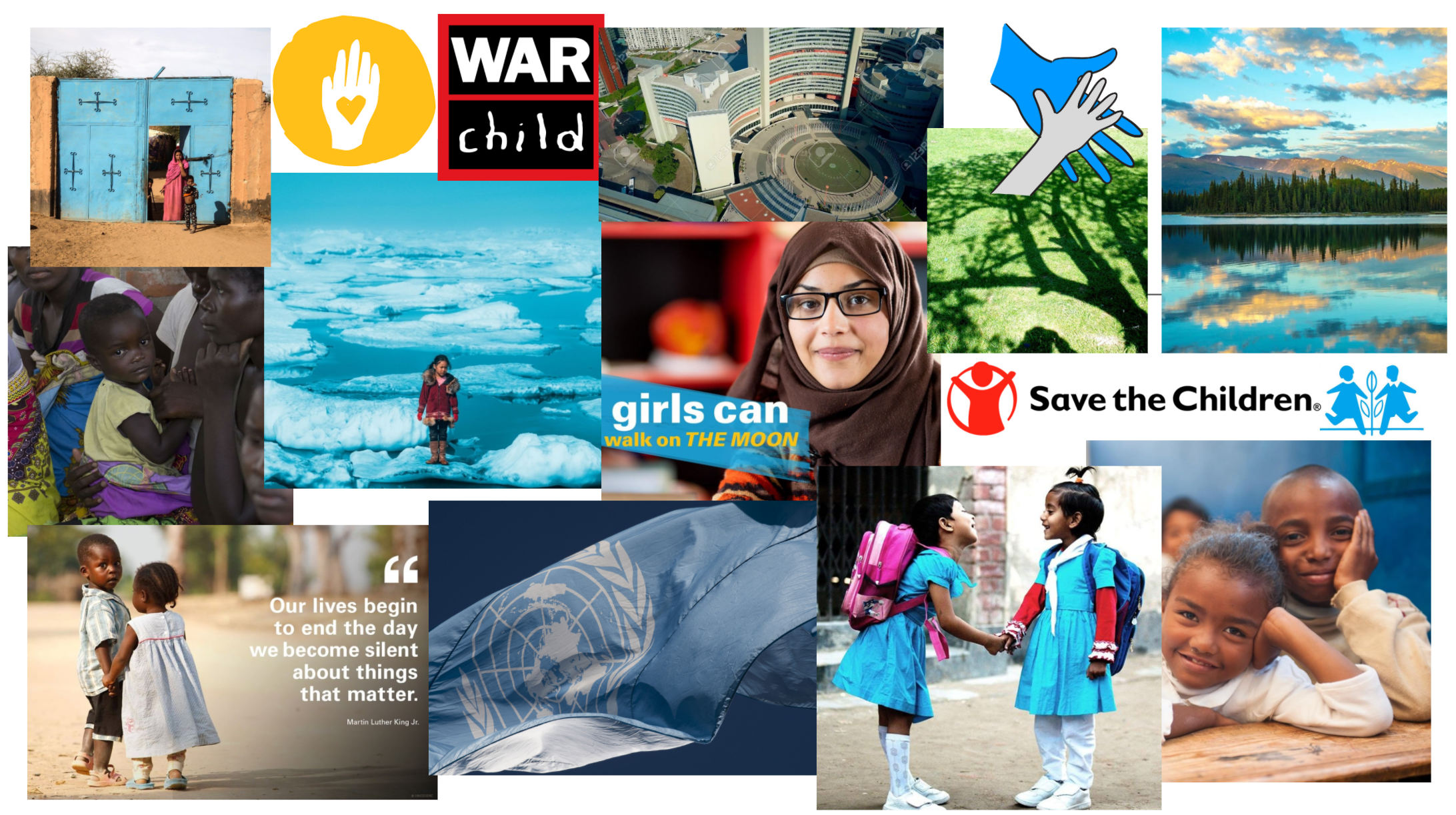
For visual inspiration, a moodboard was created based on UNICEF imagery as well as from other similar organisations.
Ideation
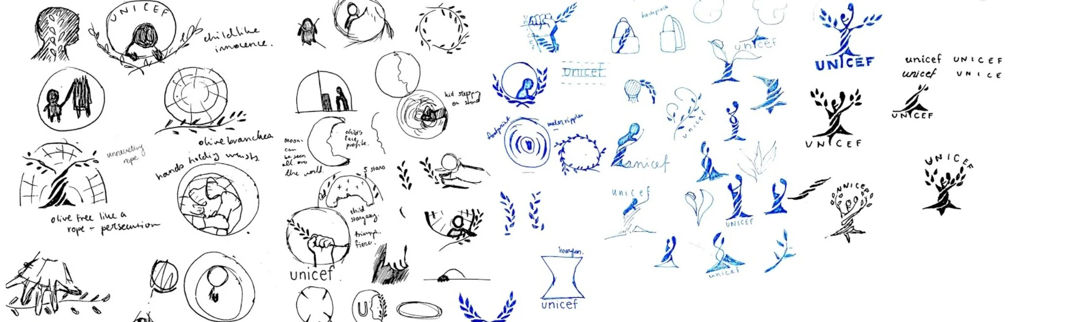
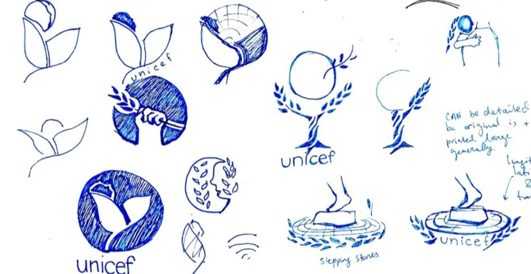
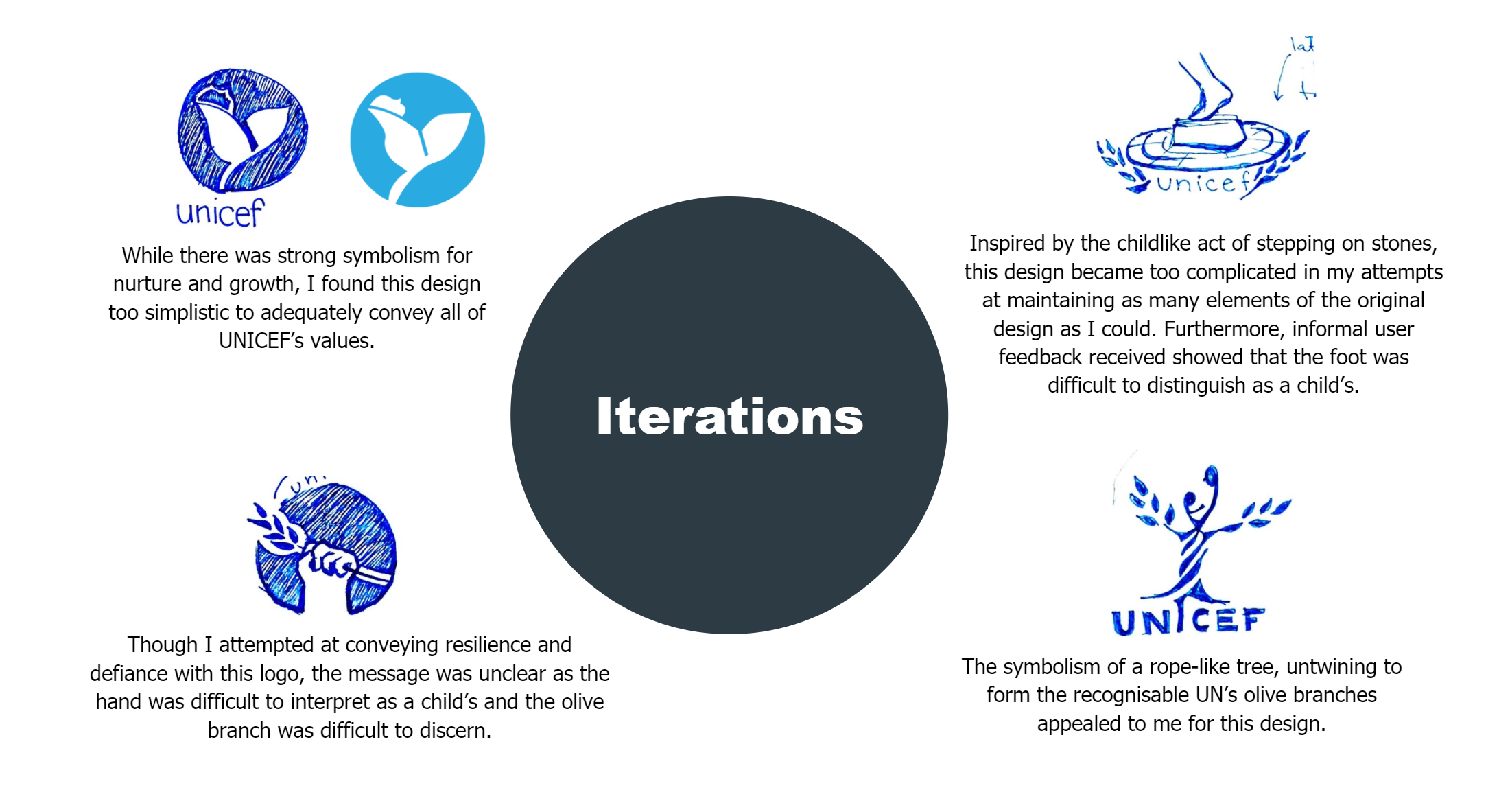
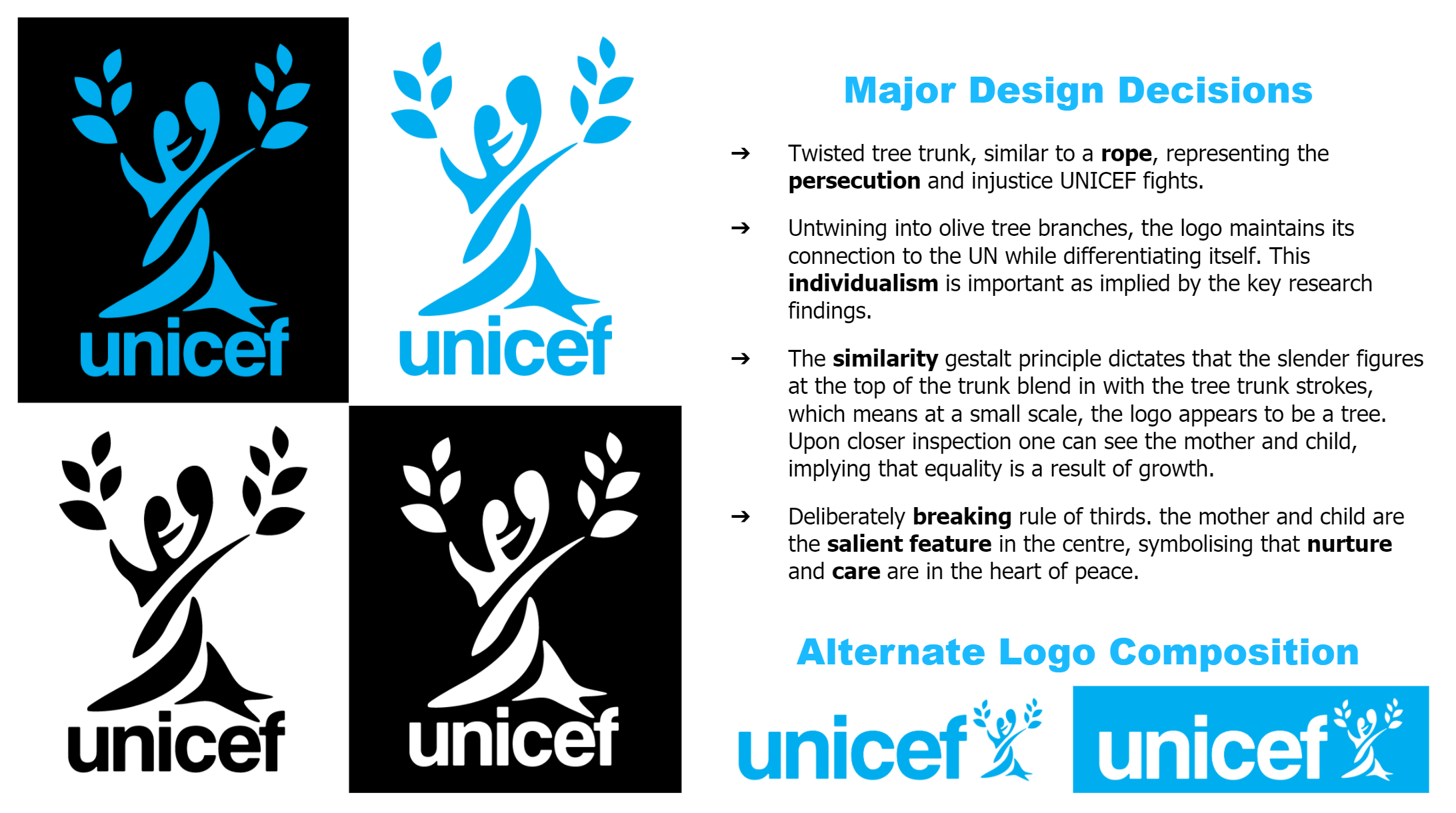
Taking both literal and metaphorical motifs from the original design, I explored logo possibilities.
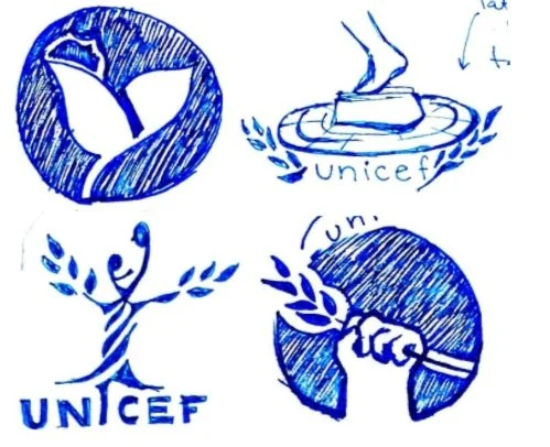
To the right were the low-fidelity designs I found most promising.


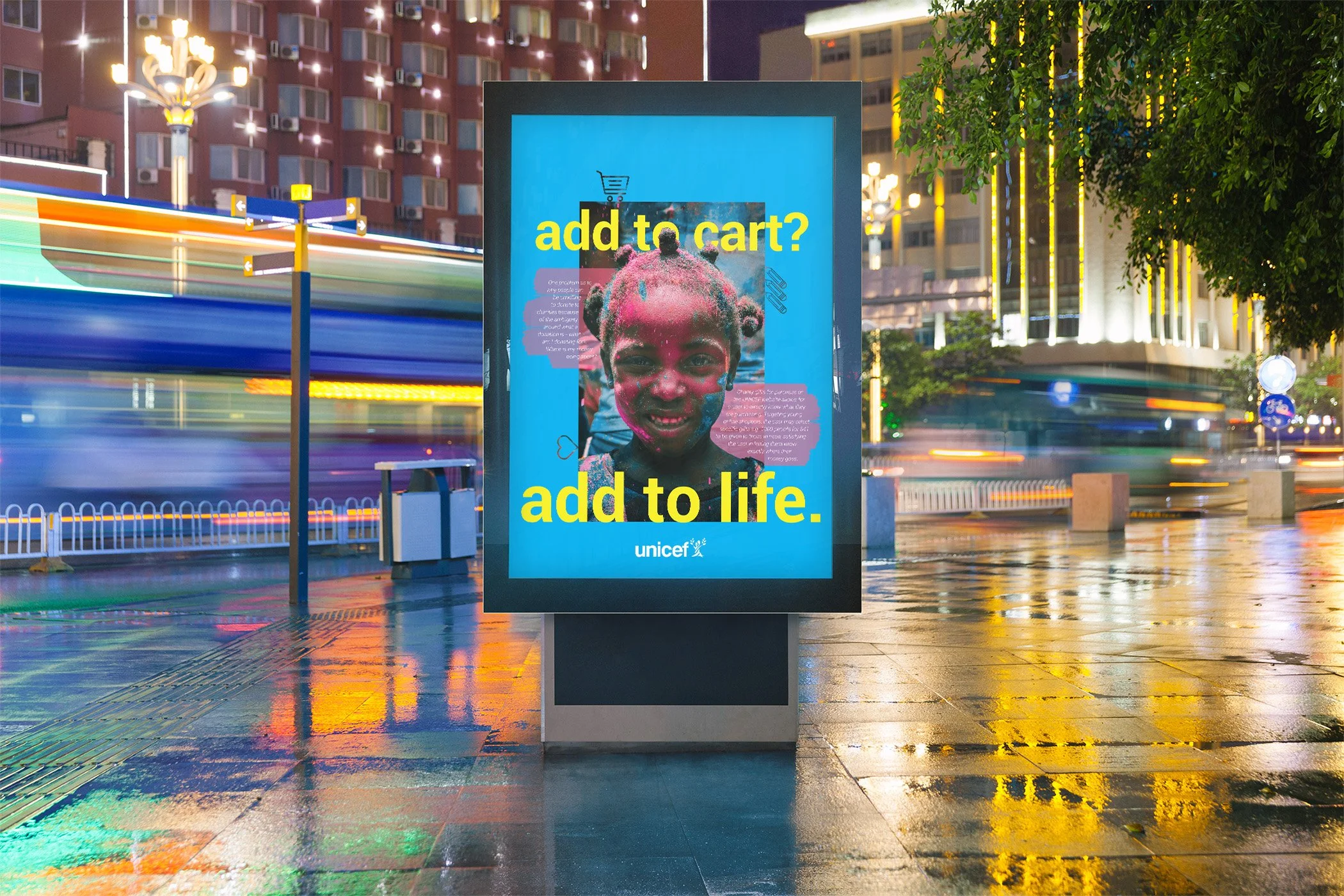
Original Poster created on Adobe Indesign